


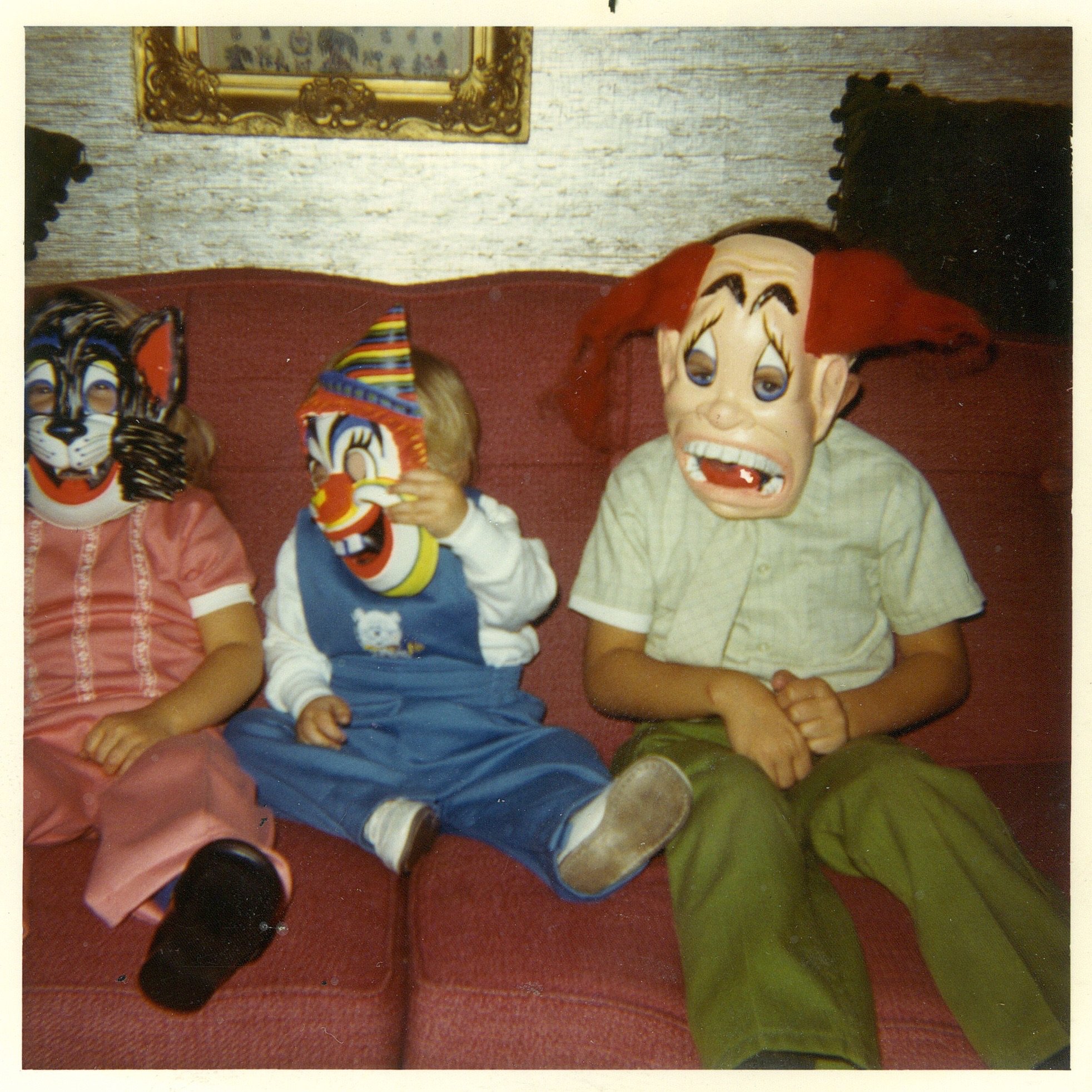
Burning Settlers Cabin


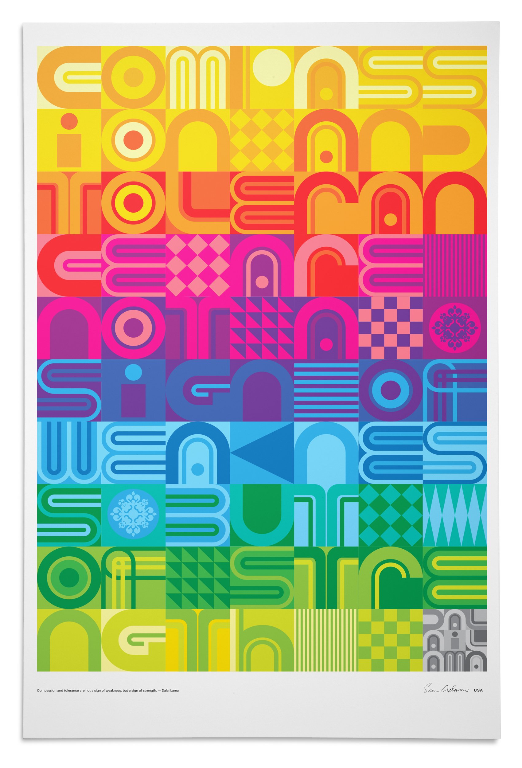
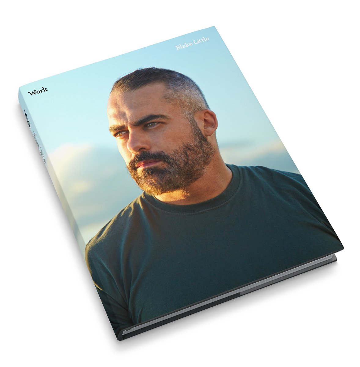
Work
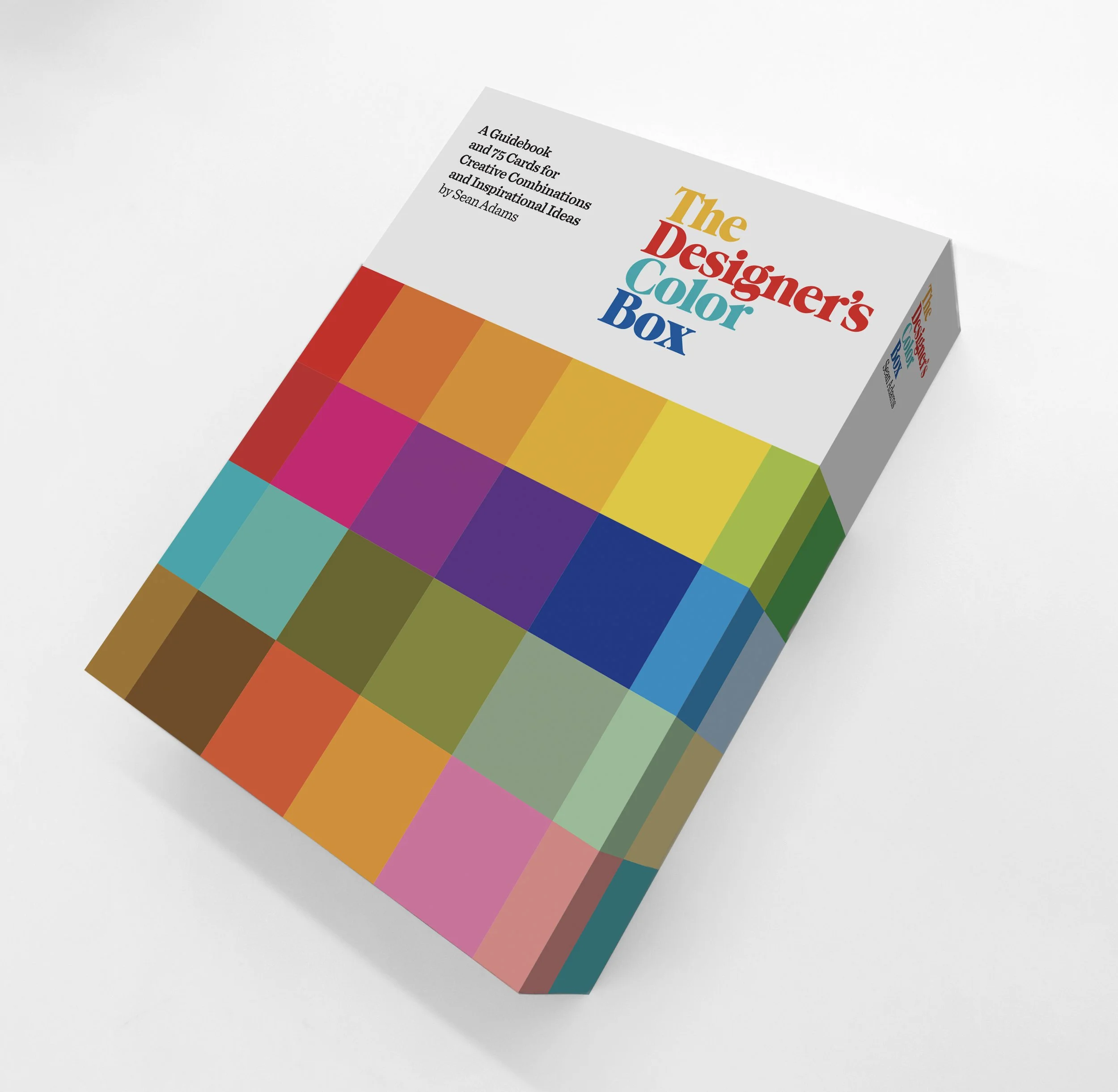
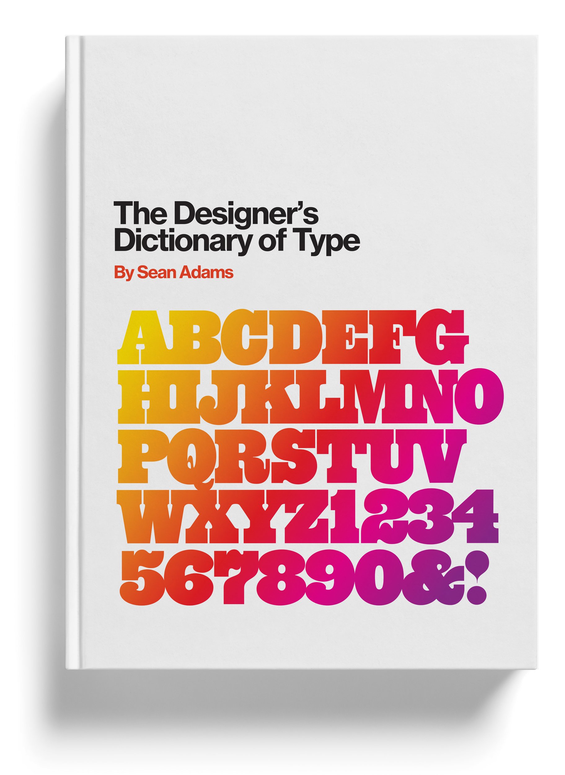
Sean Adams is the Dean of Art and Communication at ArtCenter College of Design. He is the author of nine books, including The Designer’s Dictionary of Color and How Design Makes Us Think. Adams is an on-screen instructor for LinkedIn Learning, Domestika, and Adobe. He is the only two-term AIGA national president in AIGA’s history. In 2014, Adams was awarded the AIGA Medal. Previously, Adams was a founding partner of AdamsMorioka for 23 years.
Abrams
Academy of Motion Picture Arts and Sciences
AIGA
Annenberg
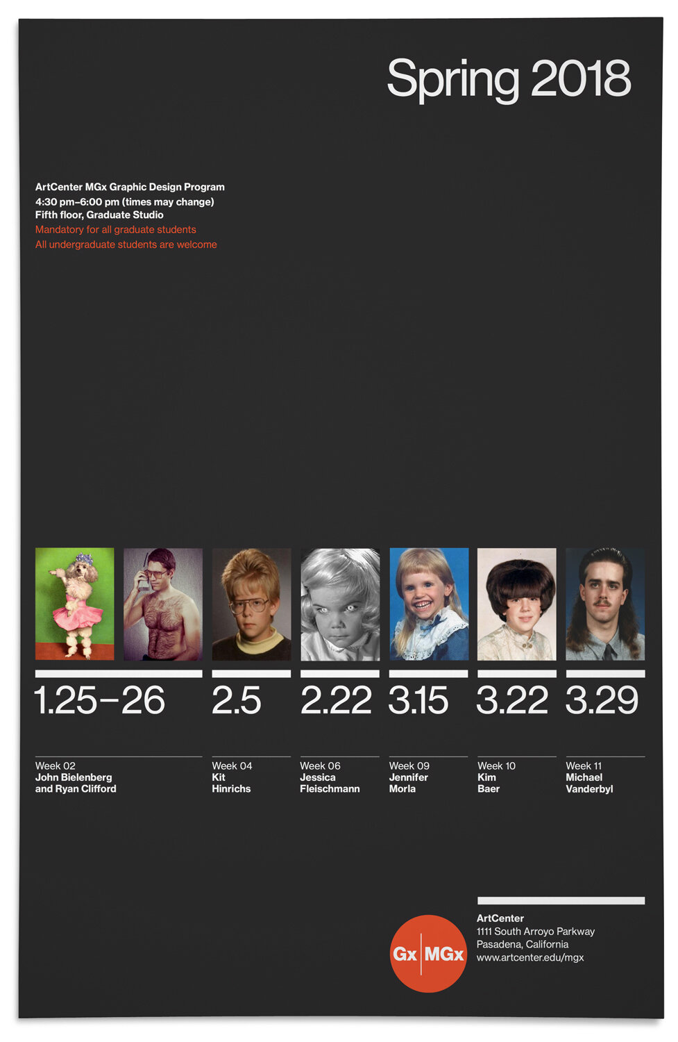
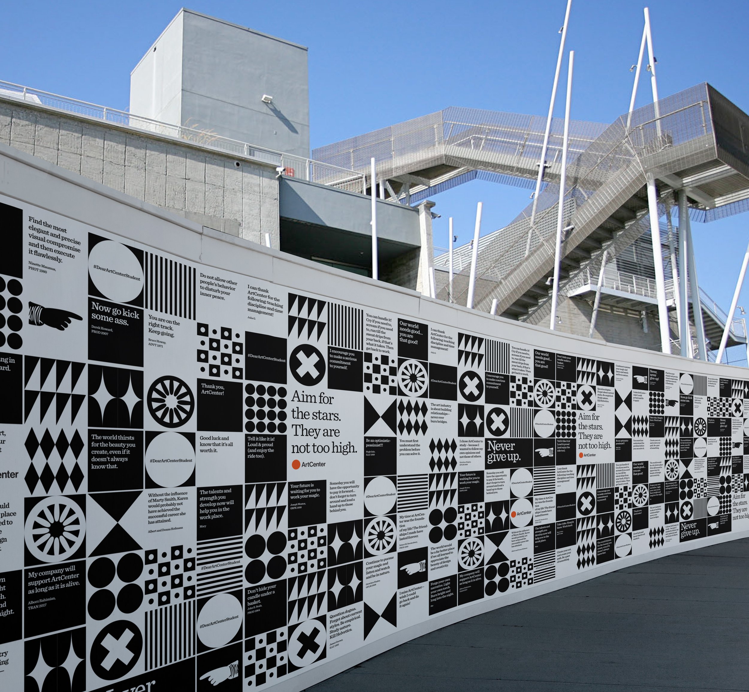
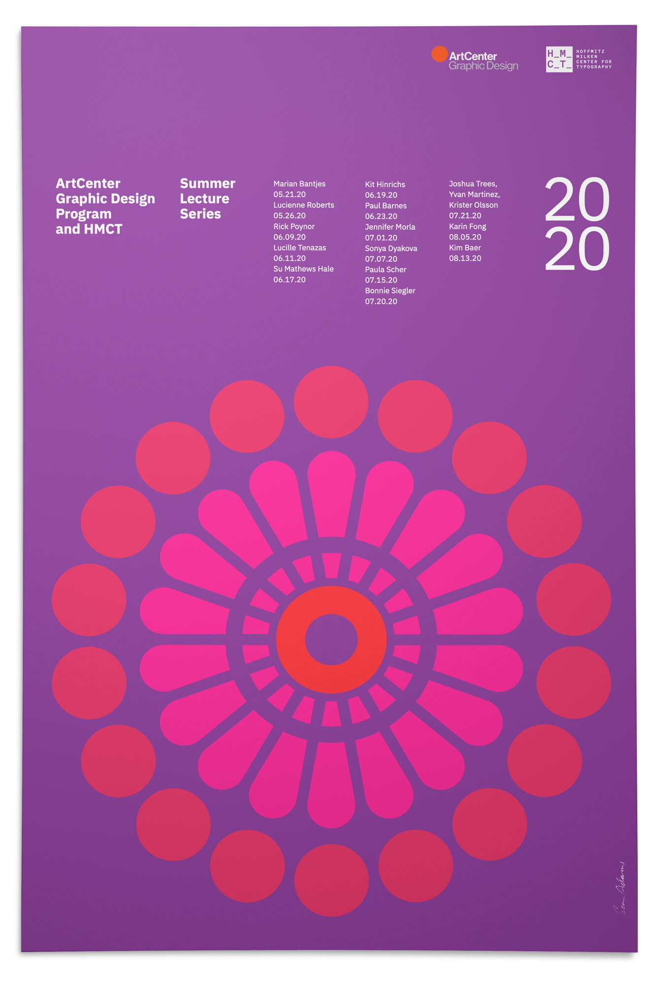
ArtCenter
Blake Little
Burning Settlers Cabin
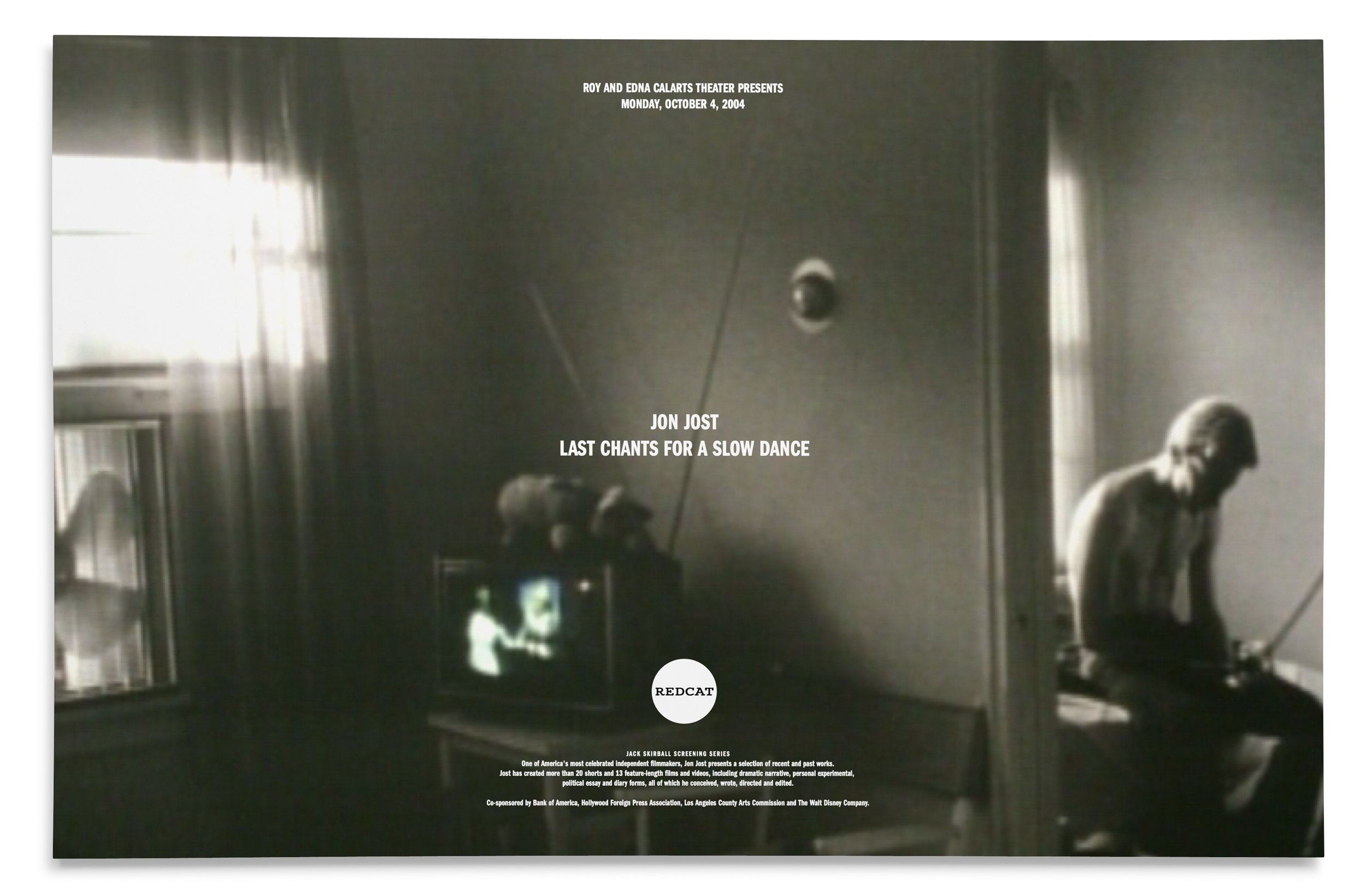
CalArts
Disney
Gap
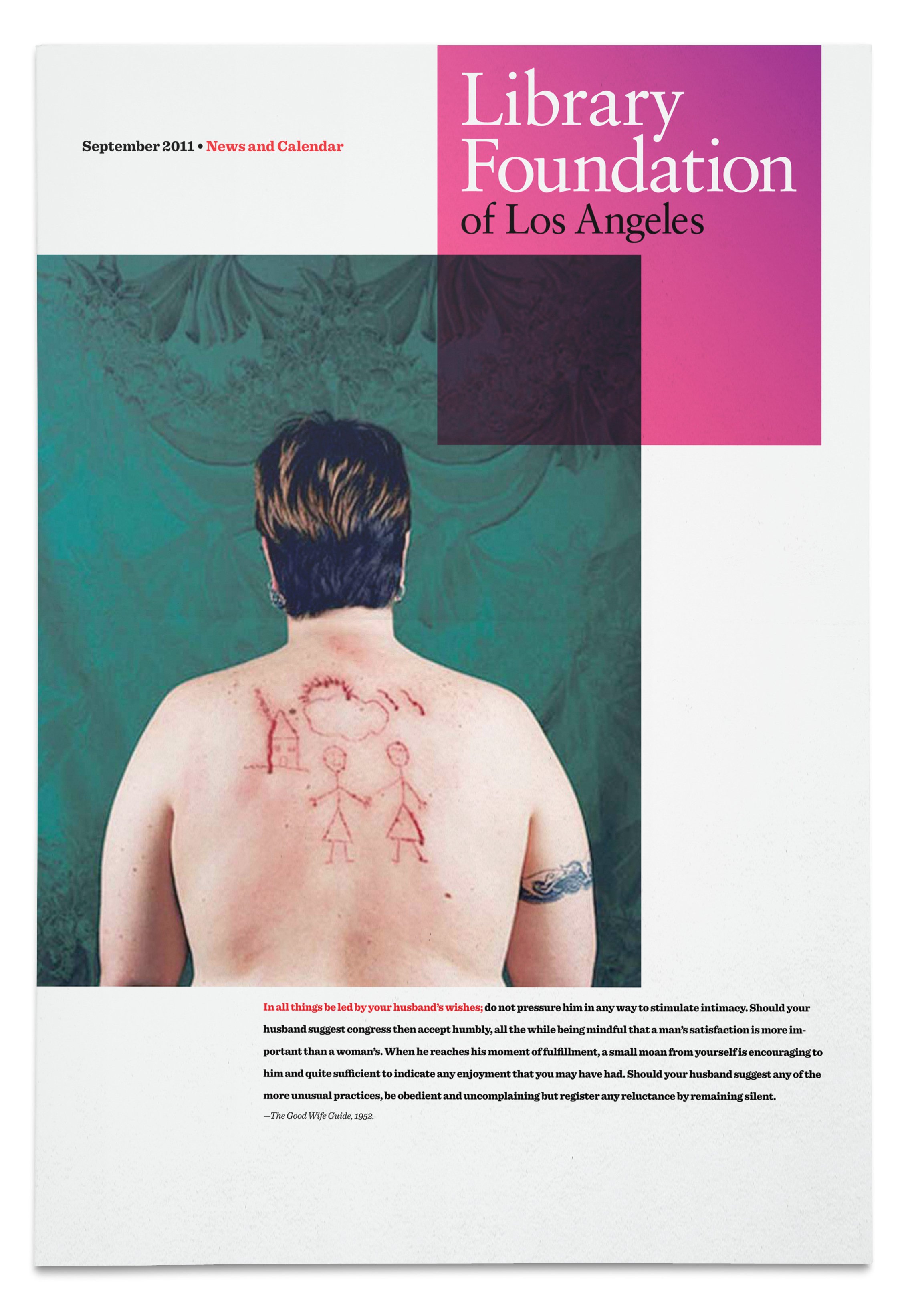
Library Foundation of Los Angeles
The Metropolitan Opera
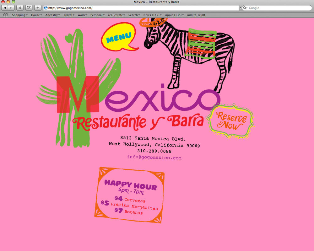
Mexico Restaurante
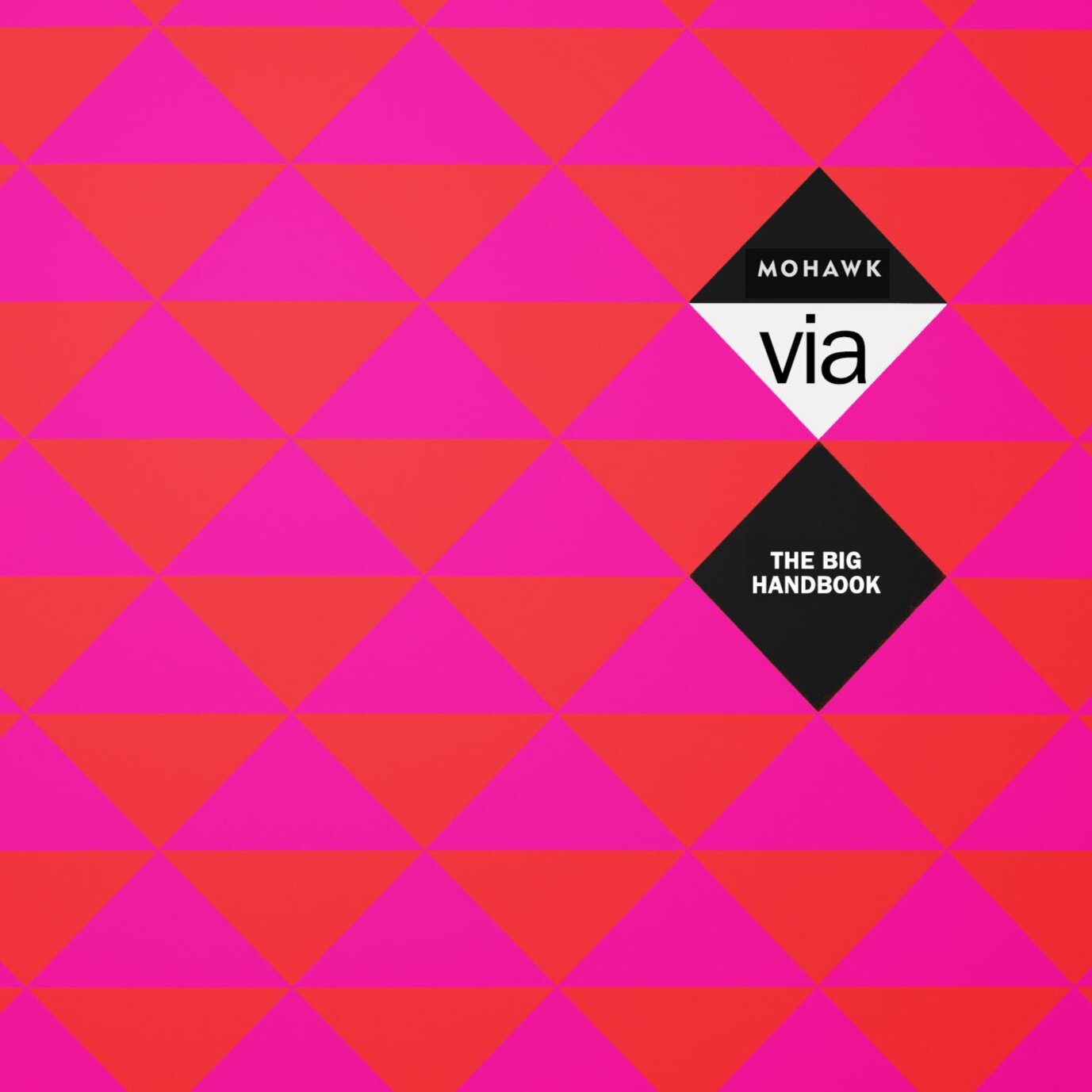
Mohawk Fine Papers
Natural History Museum
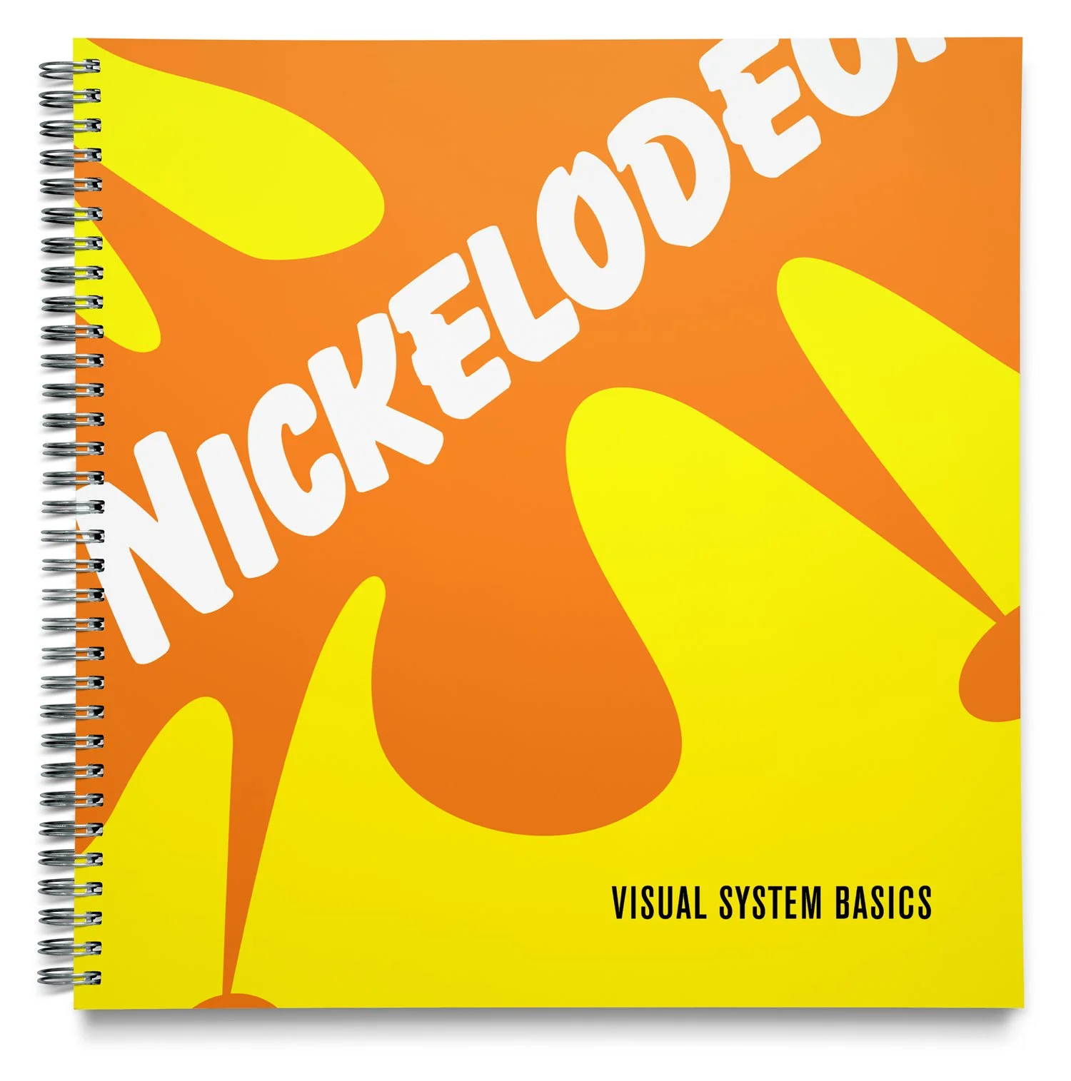
Nickelodeon
Princeton Architectural Press
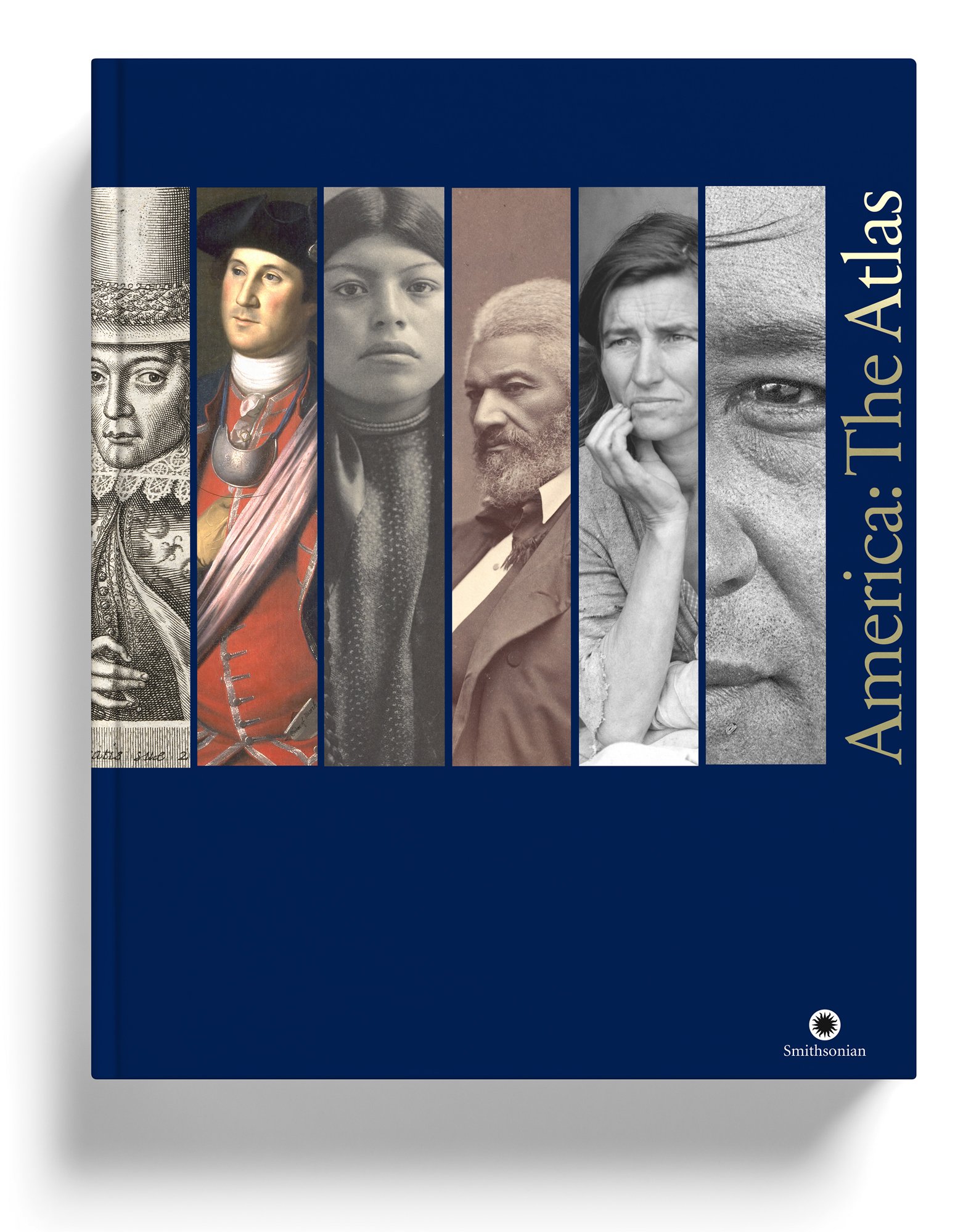
Smithsonian
Stein Eye
Sundance
Target
Thames and Hudson
UBS Network
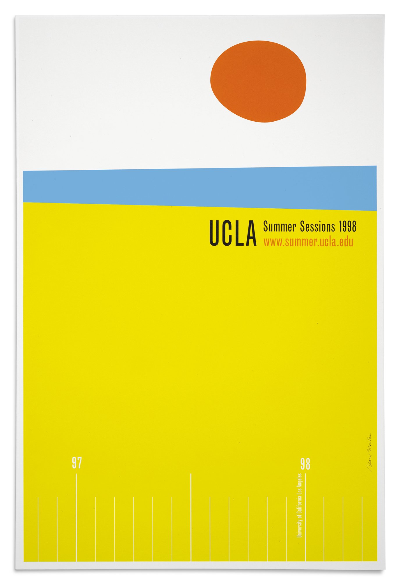
UCLA
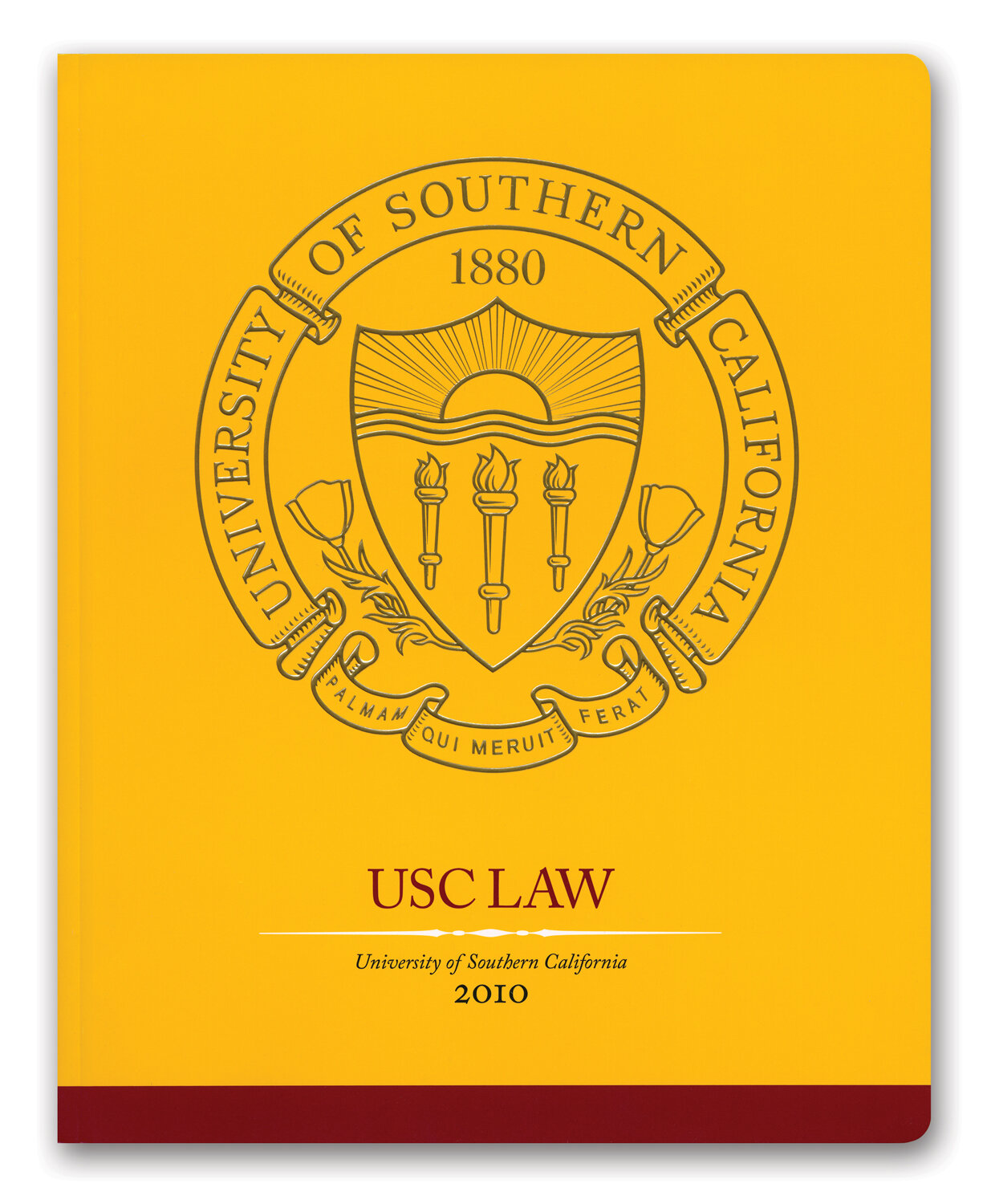
University of Southern California
VH-1