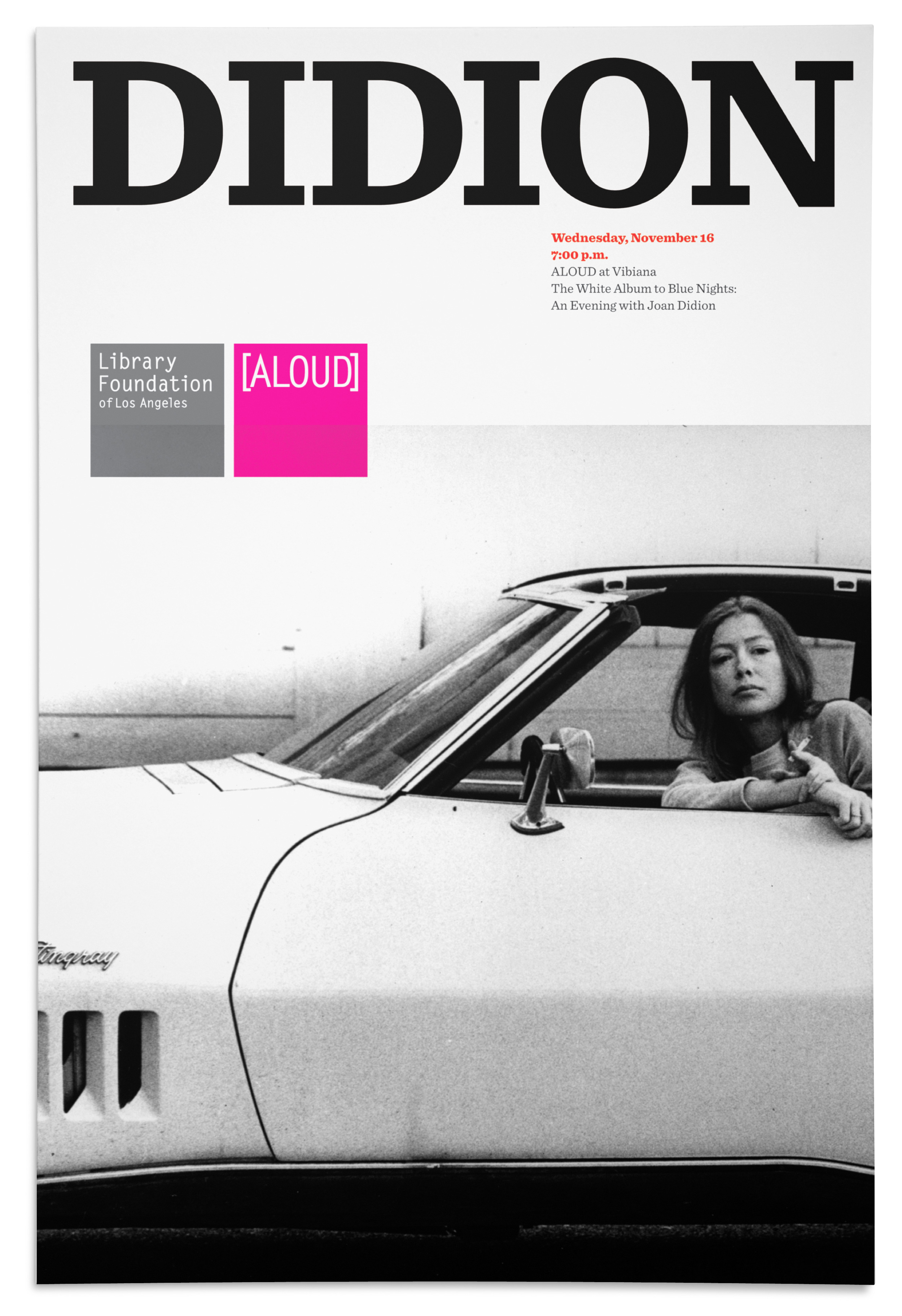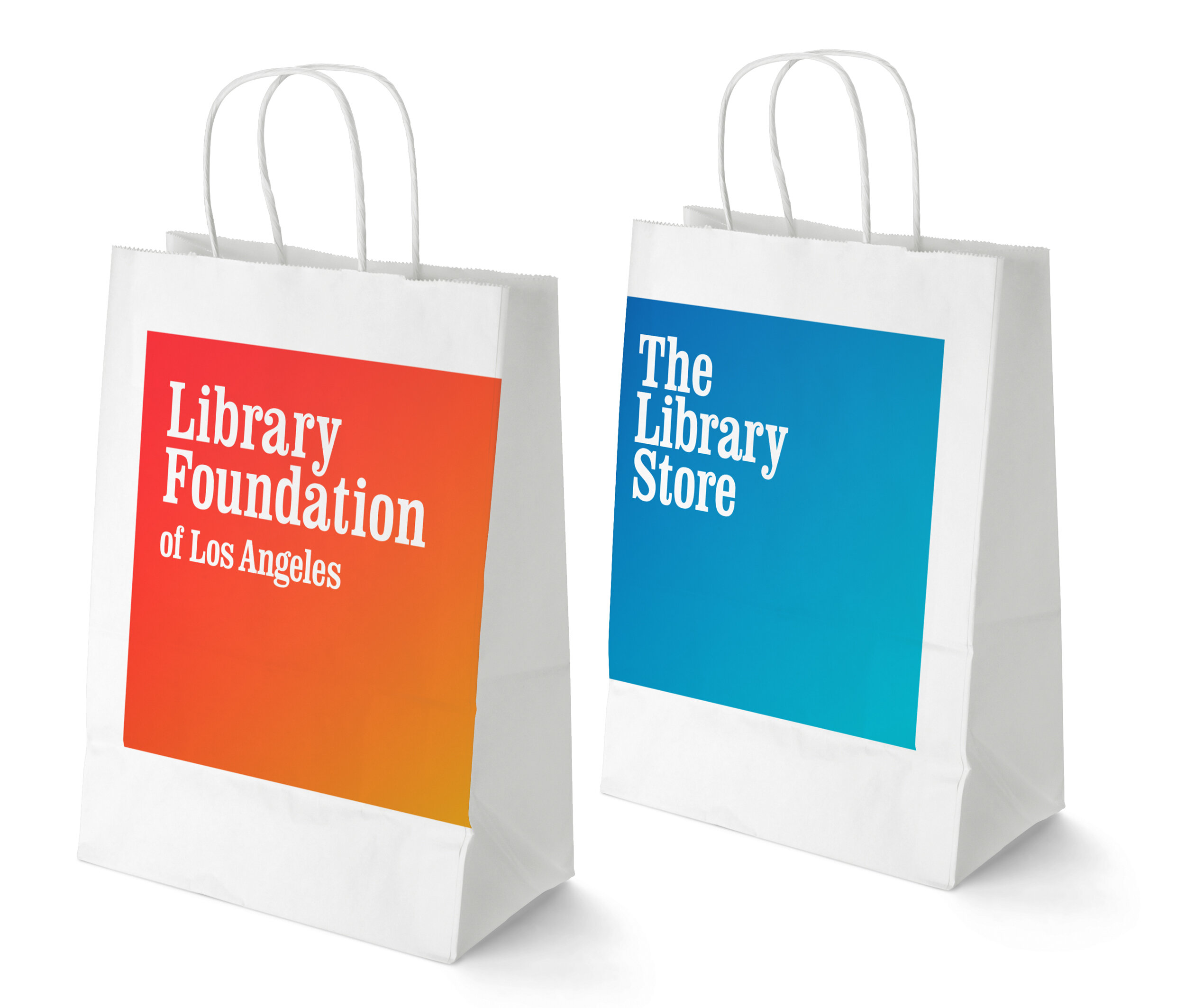

Library Foundation of Los Angeles
The identity for The Library Foundation of Los Angeles is based on the concept that typography is a picture of a word. The Library is the repository for a vast collection of information, digital and physical. The collection is as varied as the content of the books, images, and artifacts. An identity system with one fixed logo and color would be the opposite of this idea. I designed the mark to exist with the same proportions in a square.
The Library's collections are the highlight. The "graphic design" steps back and relies on the imagery, ideas, and words of the collections. Opposing concepts are paired when possible, such as Catherine Opie's feminist photography and a paragraph from a 1954 manual for women on marital sex.
Eight typographic options may be used. There are also eight gradations (once again, the range of ideas, not one fixed). This allows the final creative maker 64 possible variations. In contrast, there is one typeface for all other information and content, Sentinel, and two colors, black and red.