For Purple Mountain Majesties
It’s hard to imagine a time when the government actually promoted the graphic arts. Yes, it’s true. It was once considered a respectable vocation, not just a haven for leftist intellectuals. Between 1935 and 1943, the Federal Art Project was created to encourage American design and art. It was part of President Franklin Roosevelt’s New Deal Works Progress Administration. The federal government created the WPA to help restore the economy during the Great Depression by employing Americans in every industry. Don’t worry, I’m not going to turn this into a lengthy essay on the ramifications and legacies of this leading to Johnson’s Great Society. Let’s stick to the travel posters; they’re a safer subject.
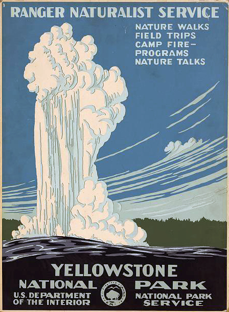
These posters promoted travel in the United States. They take advantage of the limited printing technologies available and use simple shapes to create depth. The colors are unexpected, but never seem incorrect. The Grand Canyon is a study in pink and purple. Lassen Volcanic National Park's poster has a plum colored lake and avocado green sky. Often, the posters employ a strong foreground and extreme shadows. The result is a dramatic and grand landscape similar to a Bierstadt painting. The attraction posters at Disneyland designed 20 years later, employee the same techniques.
What is remarkable to me is the clarity of each poster. They each have a strong point of view and do not appear to be designed by a committee. But, the federal government was the client, so maybe every poster was subjected to 100 committees suggesting a nice blue sky, some culturally, age, and racially diverse happy people, representation of all the available activities, colors that are more lifelike, and more detail. After all, will anyone be able to recognize the blue shapes on the left as mountains?


