

On Friendship
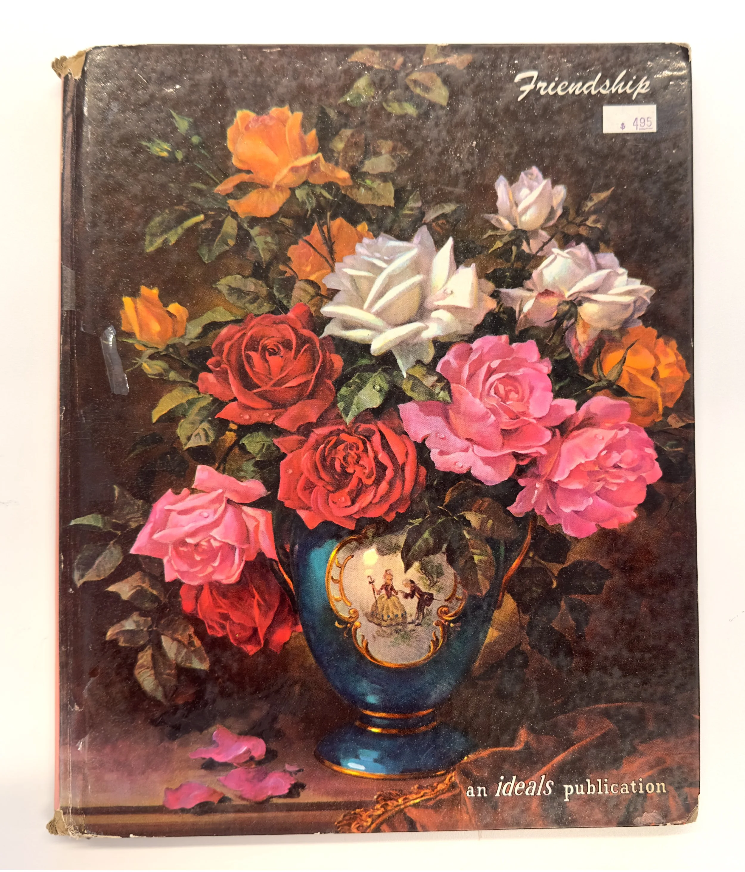
Friendship, Ideals Publishing Company, 1961


Last weekend, ArtCenter hosted the Printed Matter book fair. For those of us who love books, this was a dangerous environment. There were so many books waiting to be purchased, loved, and added to the overloaded bookcases. I maintained and purchased only one book from the ONE Archives at the USC Libraries. This represents a change in my habits. Previously, I bought books willy-nilly. And often, I showed questionable judgement.
I have a special love for the unwanted and unloved books. My pedestrian taste in wine translated to my taste in bad books. For years, I scoured the “Under $5” table in used book stores. At one point, I handed the bad books to students in an Advanced Type Studio as the starting point of an assignment to replicate the content and text with a new format and images. The book here, Friendship, is one of the unloved.
I can’t decide if it is beyond hideous or magnificently textured. First, let’s look at the content. Is it for people who have trouble making friends, shy people, or introverts? Or is it for sociopaths who don’t understand the concept of friendship? Second, what is the age of the reader? Some of the text is as simple as a Dick and Jane book, while other text integrates upper-level literature(esque). Third, who wrote this? Much of the text is attributed to Author Unknown, Our sincere thanks to the author before he passed on, and From an old scrapbook: we could not locate the author’s address.
The book’s design is a gumbo of typography with Caledonia, Goudy, Lydian, Bodoni, Kaufmann, Futura, Metromedium #2, Memphis, and a mix of casual scripts and gothic typefaces. I love mixing typefaces and breaking the rules such as “don’t mix serif typefaces”. But it takes a level of craft with scale, weight, and tone. In Friendship, the designer or thirty designers threw caution to the wind- slam those typefaces together! Use flush left, flush right, and center, all on the same page! It’s rather punk in its approach.
Interestingly, the designer borrows, intentionally or not, from the catalogue, Somer Blumen, and a letterhead for a tailor by Herbert Bayer. Bayer employs Trompe l'oeil with pins and flowers seemingly placed in and on top of the catalogue and letterhead. Here, on Reflections, the designer does the same.
The book's remarkable combination of gumbo typography, a wide range of illustrations, odd content, bizarre rotary telephone dial of people, and lack of linear pacing makes it a masterpiece. Consider the response if Tibor Kalman had designed the book. It would be revered as genius. It deserves no less love when designed by “Designer Unknown”.
Somer Blumen catalogue, Herbert Bayer, 1933
letterhead for William Prym, Herbert Bayer, 1930-33