When Bad Type Happens to Good People

I may have suspect taste in some things. My food tastes are rather plebian, I’m not so keen on subtle beiges, and I have no issue with Melmac. But I am a type snob. I try to be open minded, but I’m rigid and uptight. I mentioned at the AIGA Conference in Memphis, “Pretend there is no such thing as a bold serif and life will be better.” Ok, back off, I’m not including slab serifs. And for those who disagree, I don’t think Claude Garamond spent years in the middle of the 16th century slaving over the letterforms, hoping that someone would make them fat someday. For the same reason, ITC Garamond isn’t at the top of my list. Type should not be cute. I advise my students to stay away from anything too hip and groovy. These fonts that are all the rage will be like senior class photo from high school and your hair style. “What in God’s name was I thinking?” you’ll ask years later.
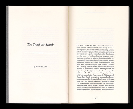
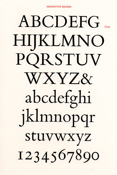
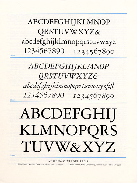
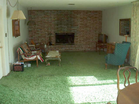
When I first started working as a designer I was at The New York Public Library. Many of my projects were for Library trustees or donors. We know money doesn’t buy good taste, and this is especially true with typography. Tiffany (the typeface, not the store) seemed to be all the rage on the upper east side of Manhattan in the mid 1980s. I don’t know why, but it was a disease. I would present an invitation or book design set in Bembo, and someone would pull out something with Tiffany and suggest we use it because it was “classy”. I learned the best response was to explain that these kinds of typefaces were like green shag carpeting. Good people really don’t use that.
