Helvetica is Jan
Speaking after Stefan Sagmeister at a conference is a bad idea. I've done this many times. It's not that Stefan is nothing less than a true gentleman and good friend, it's that when he finishes, I can look out at the audience from the side of the stage and see people streaming out en masse. "Well that's what I came for, time to go," they must be saying. I'm not crazy about doing this, as I tend to come off as, "and now for the easy listening break."
Years ago, I spoke at a conference following someone, not as generous as Stefan, who was one of the hip and cool designers at that time. She talked about the critical theory and deconstruction of meaning regarding a logo she designed that looked exactly like Helvetica, but the crossbar of the "A" was removed. People seemed enthralled. I just thought, "and..."
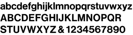
Now, I've become that person, waxing on about the importance of the differences between Haas Grotesk and Helvetica. Sorry. I know everyone has a major hard-on for Helvetica, but I can't look at it as anything but the less attractive sister of Haas Grotesk, like Jan and Marsha. Originally, Helvetica was Haas Grotesk, but over time changes were made for expediency. Christian Schwartz redrew Haas Grotesk in 2004, based on Max Miedinger's 1957 version.
Compared to standard issue system Helvetica, it's elegant, crisp, warm, and legible. It doesn't suffer from the "generic" look of Helvetica. I've been using it probably more than I should. I promise, however, to not talk endlessly about the lower case "r" at my next lecture. Maybe just a little.