Crazy World
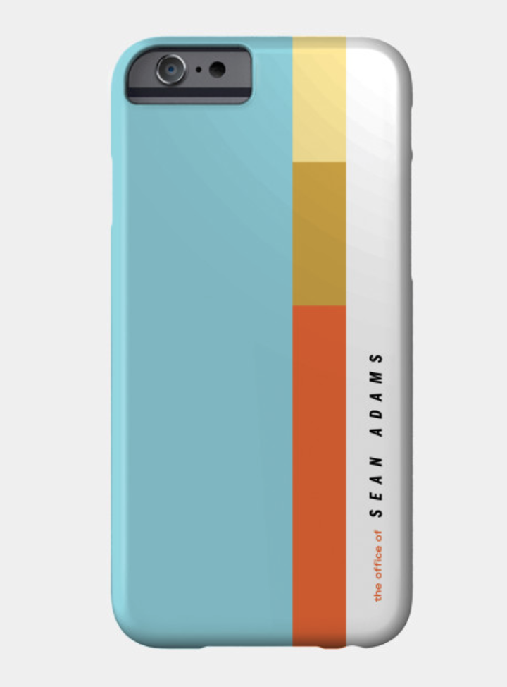
my iphone case
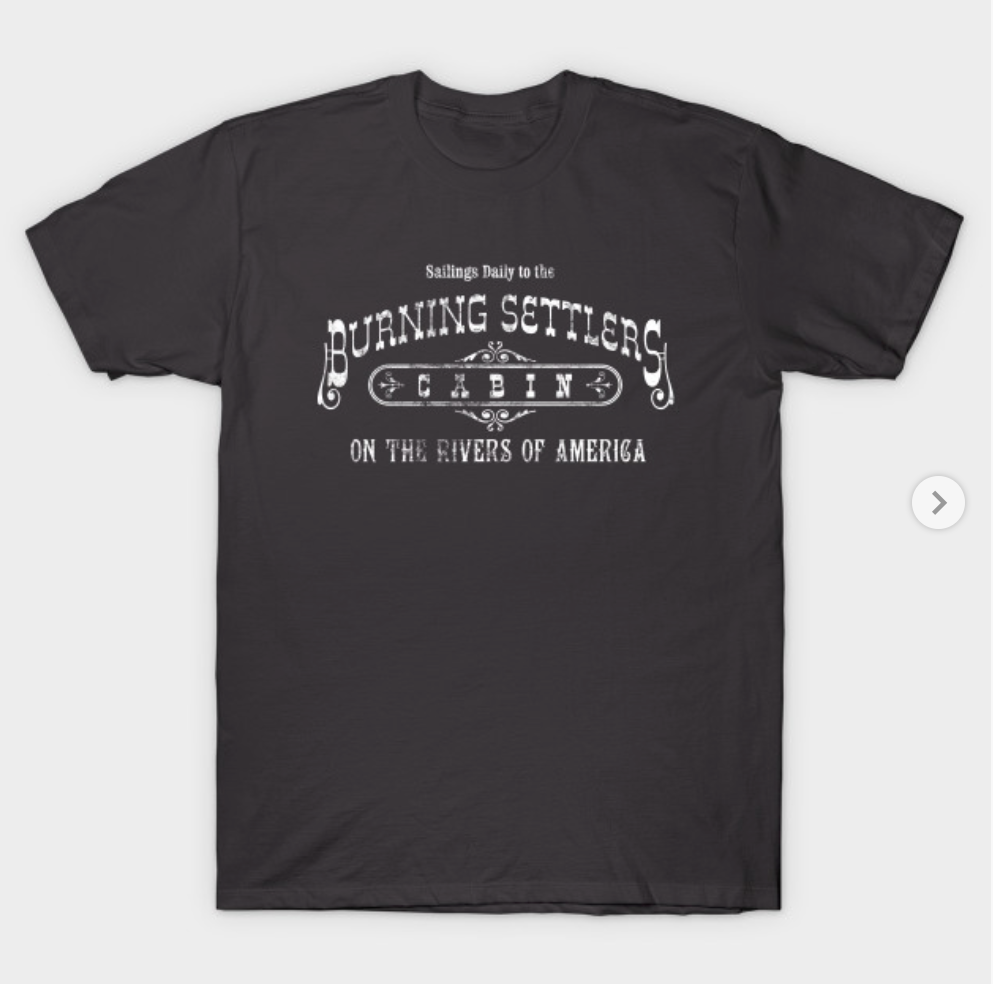
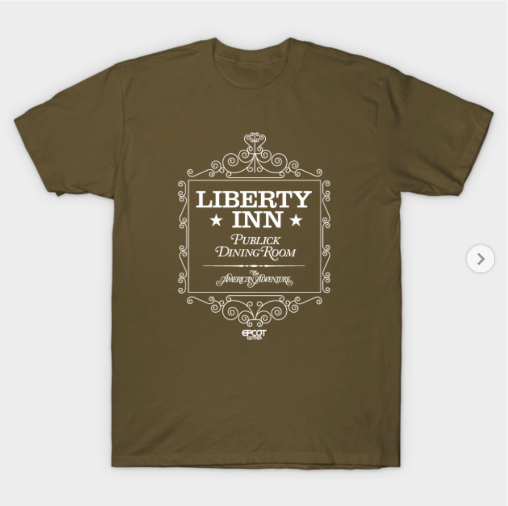
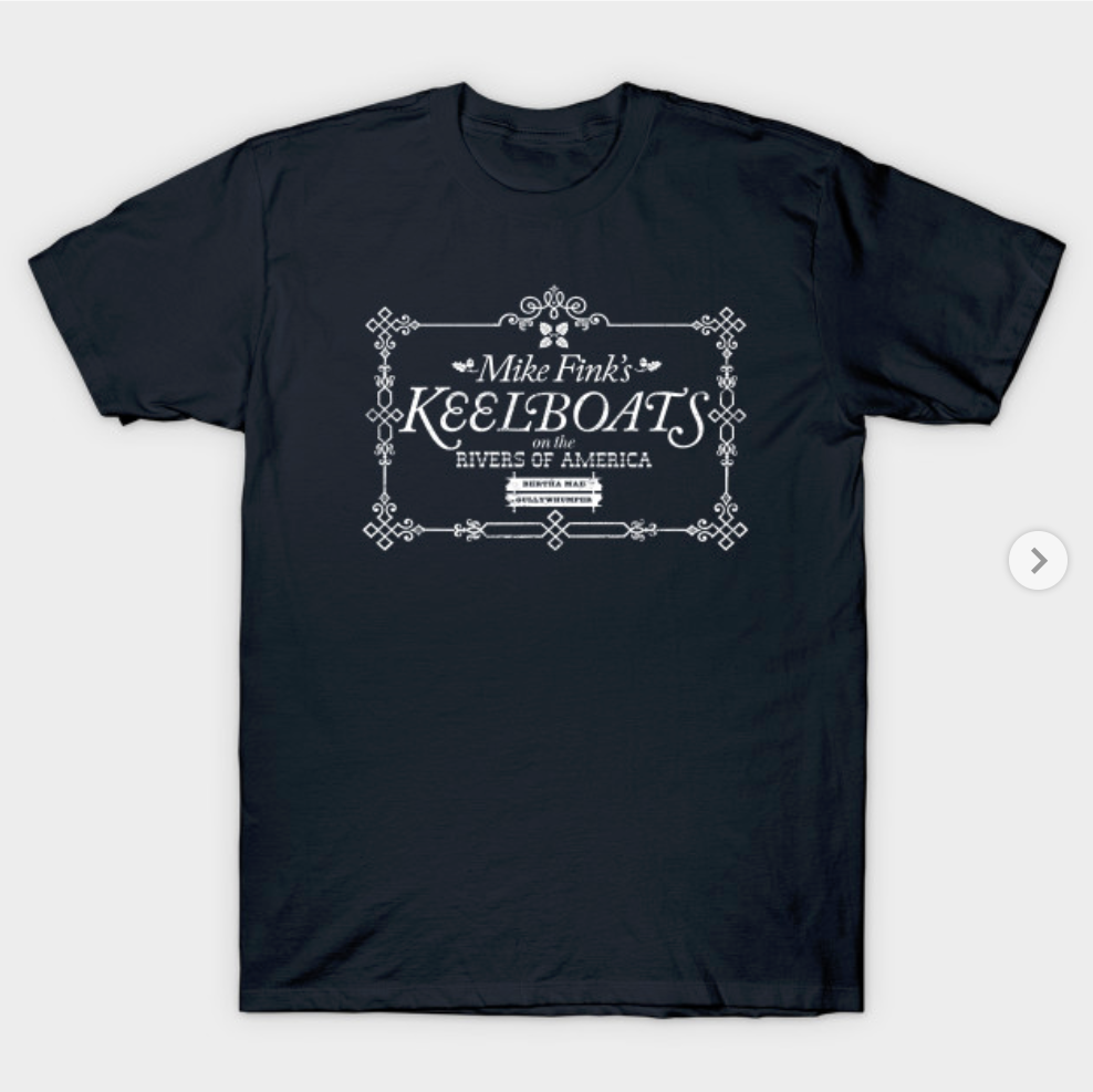
Last year, I was obsessed trying to find a t-shirt for the long-gone attraction at EPCOT, El Rio del Tiempo. Not surprisingly, this was not a hot commodity as a new attraction replaced it years ago. We all know how this goes: one gets an idea to buy something, say a t-shirt for the long-gone Golf Resort, an obscure Swiss typography book from 1965, or burnt orange mugs. Then, it is impossible to move on.
When I couldn’t find the El Rio del Tiempo t-shirt, I decided to make one myself. Fortunately, I’m a designer and can make things. I started using teepublic.com to make notebooks for incoming students and my iphone case. As implied by the name, they also make t-shirts. I drew my version of the logo using a tiny, tiny, tiny part of a photo I took at the Mexico Pavilion in the 1990s. Why worry about authenticity if I liked my version better?
I uploaded the art and ordered a t-shirt. In a few days it arrived. I could now wear it while walking my mother’s dog or on weekend as the geek I truly am. Pandora’s Box was now open once I realized I could make the t-shirts or other items I wanted simply by creating the art and uploading it.
Normal people like to buy shirts, tote-bags, mugs, and other items with current attractions or characters from films. I was more interested in what was gone. I’ve done things to type I could never imagine in order to create the best version of a mark made in 1967, 1971, or 1982. I purchased typefaces that challenge any sort of decent taste. I don’t regret these transgressions. I can have an avocado green Lake Buena Vista Shopping and Dining bag, or a Magic Kingdom 1971 delft pattern, or t-shirt for the 1974 Walt Disney World Golf Classic (not a real event).
Of all the typographic wrongdoings, I am most pleased with the Welcome to Walt Disney World art. It’s based on a grainy image of a temporary brown sign from October, 1971. The letterforms don’t match as if the sign-maker ran out of Helvetica and dropped in a some Trade Gothic, Futura, and other sans-serif letters. And kerning? Kerning be damned. Of course, I’m one of the only people who ever buy any of my shirts. So I only need to please myself.