American Beauty
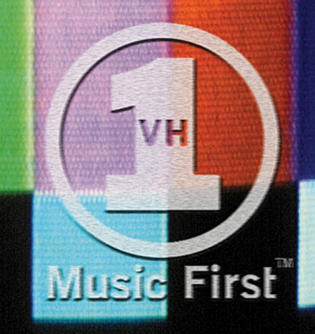
Several years ago, VH1 changed their logo. We designed the previous one. The mark we created wasn’t flashy or wildly exciting. It was a simple and clear identifier. We added the words Music First into the mark to remind the audience, internal and external, that VH1 was about music, not Gallagher specials. The solution worked, the network had clarity and focus. Ratings increased dramatically, not because the logo was good, but because the new programming was great. Like Paul Rand said, “A good logo can never make a bad product good. But it can make a good product spectacular.”
When the next iteration of the logo (after ours) was launched, several magazines asked for my opinion of the new one. At the time, I answered diplomatically, “I don’t know the business reasons or criteria for the change, so I can’t comment on the success or failure of the new version.” Well, that was dumb. Now a decade later, I look at the backwards 1/leaf version and can say, “WTF? Ugly.”
American Airlines just changed their identity. I appreciated Massimo’s honesty about the redesign, and I agree. Massimo’s mark is simple, clear, and timeless. It will be relevant another 50 years from now. Why does every corporation now think they need a logo that looks like a internet company in 1999? Most importantly, however, is the fact that the tens of millions of dollars spent on implementation could have been used to save and create jobs. Our role as designers is to help our clients succeed. This means they keep employees, hire people, expand, and provide higher wages. Something shiny and new will never be better than that.


