Putting the Gloss onto Glossy
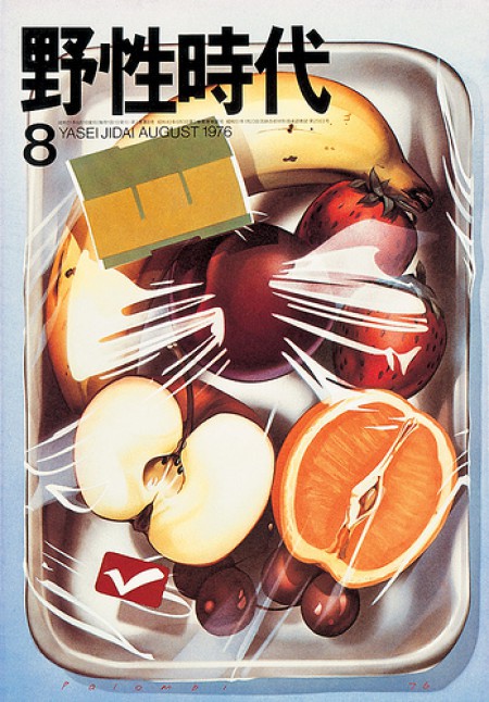
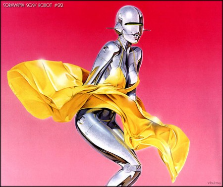
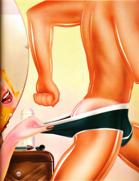
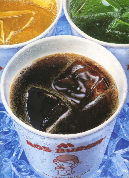
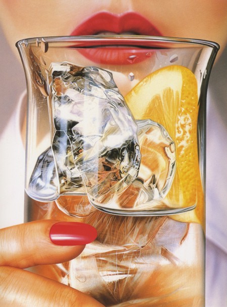
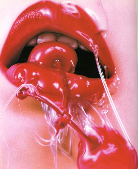
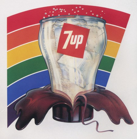
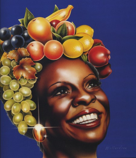
Lately, I’m missing shiny. After two decades of adhering to the flat world, I’ve begun to admire the shiny stuff. For years, clients asked for shiny and sparkly type in three dimensions on every motion design project. Of course, we didn’t do that. We took the opposite point of view, focusing on the simple forms and lack of ostentation. So, why now, am I drawn to airbrush illustration of the 1970s and 80s? Everything in these images is so clean. Even skin is glossy because it’s so pure.
I assume the crystal clear, high gloss approach was a reaction against the earthy and organic design of the 1970s. Much of the airbrush work was done for the music industry at the time. The crunchy political music was replaced by slick disco that celebrated hedonism. So it makes sense that the illustration would also celebrate a slick veneer and present sex, fast cars, and youth as the subjects.
A couple of weeks ago, I decided that our Eames conference table at the studio was too matte. Somebody had repeatedly cleaned it with 409 or Windex. That’s not so good with wood. So I brought in my trusty wood oils and wax. After one application of oil, the table still seemed dry and flat, so I flooded the surface with it. “I’ll let this sit overnight and soak in,” I thought. Unfortunately, I didn’t count on someone using the conference room for a meeting. Since I am one of the owners, I couldn’t be fired. But, if I weren’t, oh boy I’d be out the door fast. People don’t like oil soaking onto their shirts and presentations.
