When Illustration Takes a Holiday
The first image we recognize as human beings is a face. Babies can recognize parents and mimic expressions within days of birth. We operate as social animals by identifying other people we know. The human face is the first place we look. It gets our attention. This is why every magazine cover is an almost life size image of a face looking at the viewer. It works to get our attention, but not particularly exciting or unexpected.
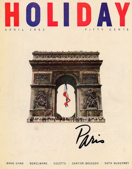
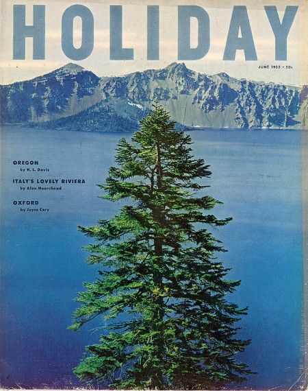
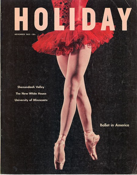
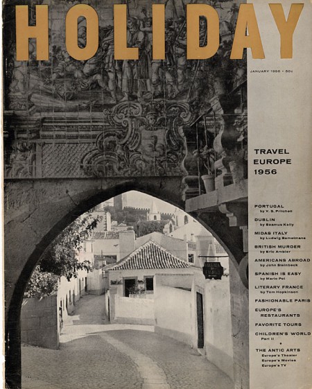
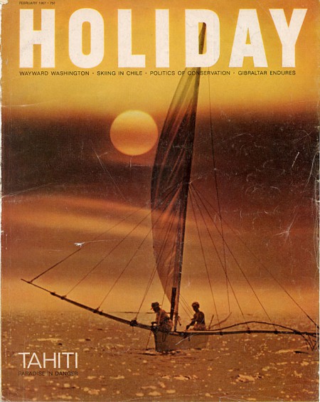
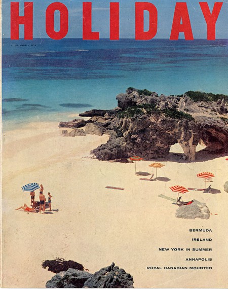
In the 1950s and early 1960s, Frank Zachary was the art director at Holiday magazine. He hired relatively unknown illustrators for the covers. Most of these star illustrators later. The illustrative covers never fail. They are light, often funny, beautiful, and smart. Holiday’s photographic covers, however, have been relegated to history’s sloppy seconds. Perhaps it is due to the surplus of photographic covers now. The illustrations seem completely fresh and new. But, why do I keep going back to the photos on the covers?
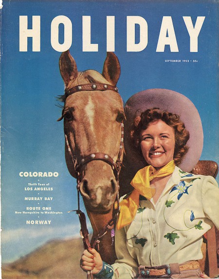
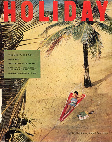
First, they are not the standard big head staring at the viewer. Second, the scale, point of view, and overall composition are often unexpected and odd. Third, the subject matter is never the obvious. An issue on Park Avenue has an abstract image of car lights. No attempt is made to show Park Avenue clearly. The issue covering the Caribbean’s photo is shot from a bird’s eye view, minimizing the bathing suit clad woman in the hammock. I especially love the September 1952 issue on Colorado. At first glance, it’s a standard portrait of a young woman and her horse. But, look closely. The young woman is not focus on the center of the page. The horse is. This is a beauty shot of a lovely horse.


