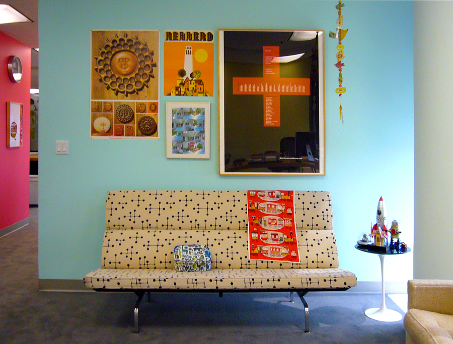
The Colors of the Sea

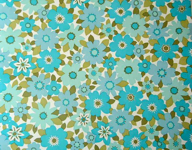
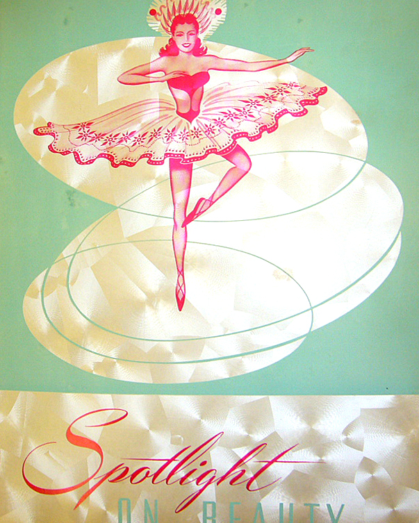
Here’s a trick when choosing colors: the in-between colors are always more compelling. For example, seafoam isn’t blue or green. The viewer needs to do a little work and this creates a more dynamic response. The same holds true for all other colors. I like red with a little orange. I hate flat purple, but love something a little bluer like the dense color of a blueprint. The default color swatches in Adobe Illustrator are there as a starting point. Like the circle tool, they’re boring until you do something interesting with them.
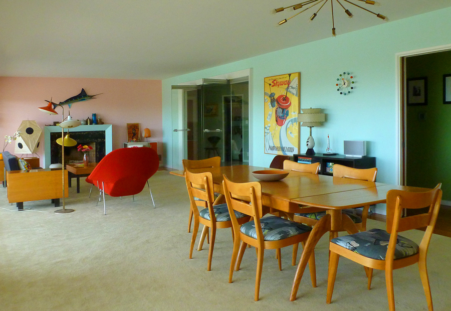
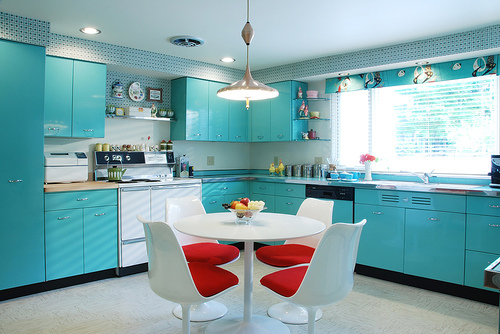
Whenever I decide to paint a room, I pull out the paint swatch book and tape different swatches to the wall. Unfortunately, they are all slightly different shades of seafoam. To my eye, they are radically different, but at the paint store they look at me like I’m crazy. The kitchen is a light seafoam, the bathrooms are all a slightly greener version, the laundry room is slightly bluer, and the living room is a tiny bit more intense. In all honesty, I’ll admit they all look like the same color on the wall. So my attention to color detail is lost on any guest.
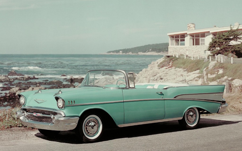
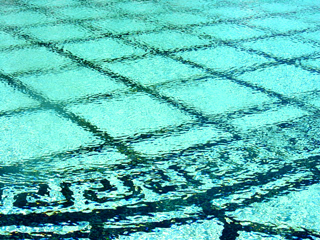
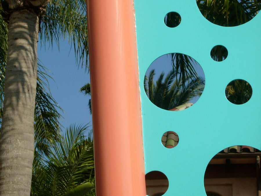
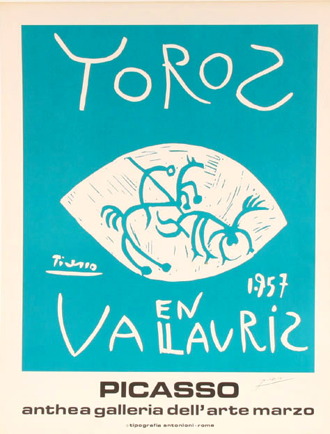
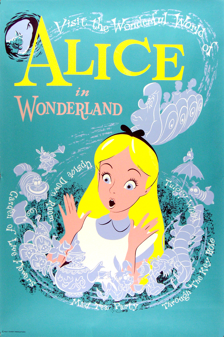
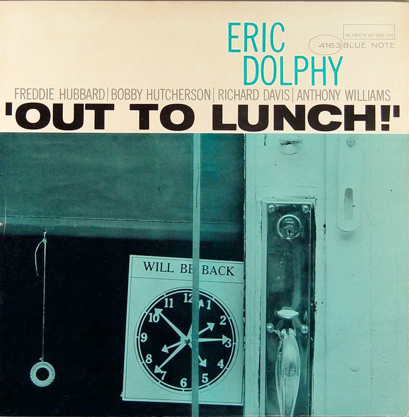
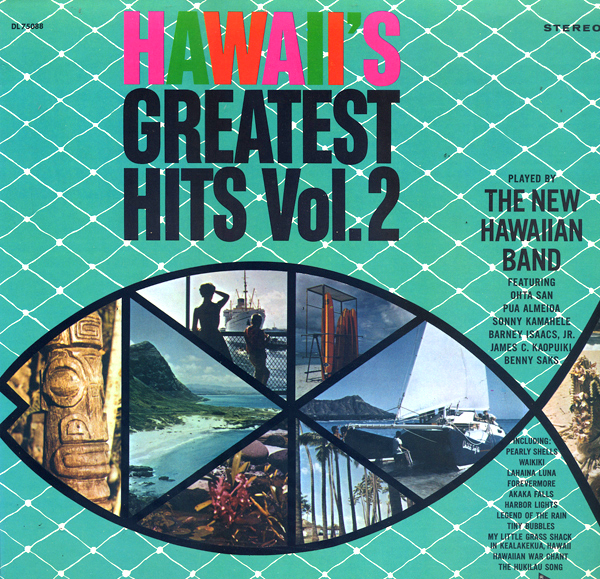
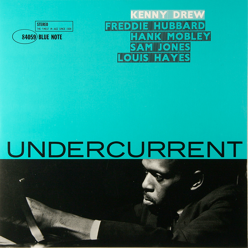
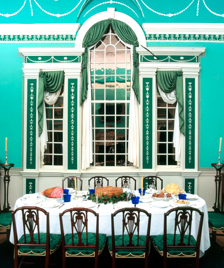
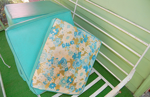
Seafoam is one of those colors that people respond to in extremes. They either love it, or hate it and want to hurt someone. Someone once asked me at a speaking engagement what my favorite Pantone color was. I answered, “I love seafoam, PMS 318.” Years later, I found a blog written by someone in the audience who insisted PMS 318 was not seafoam, but turquoise, and I didn’t know what I was talking about. My advice is to call it whatever makes the other party happy: seafoam, turquoise, blue-green, Mount Vernon Prussian blue, swimming pool blue, or aqua.