More More
Sometimes, too much is not enough. This may seem contradictory to the typical badgering I do about minimalism. The point of minimalism is to use only what is needed and nothing more. And there are instances where quite a bit is needed. A few years ago I went to Hallmark in Kansas City to give a talk. On the tour of the headquarters, I saw the remarkable diorama Alexander Girard designed. Now, I typically, am not a big fan of cute Victorian paper dolls and tiny shoes. But in this context they sure looked good. Mary Blair was genius at combining multiple forms into a cohesive whole.
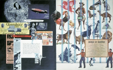
That same skill is evident in a feature Will Burtin designed for Fortune magazine in 1947. This is why the Burtin spreads work: First, there is a clear and strong grid structure. The elements work proportionately with each other. Second, Burtin uses scale to create drama and pacing. The cigar Indian is huge, while the huckster person is small. There are tiny and huge elements. Third, the pages are not a sea of rectangles, or as we like to say, “do not make that look like the wonderful world of rectangles.” Images are silhouetted, odd shapes, or trompe l'oeil. And finally, the color and typography are simple, consistent, and minimal.
However, beware of the temptation here. As you can see, it can be easy to become promiscuous with imagery. You don not want to be a layout slut, adding as many varieties of images and shapes as possible.


