Design in Space

Several years ago, we pitched the idea of doing a show about “design in film” to the Sundance Channel. Yes, this was stepping out of our job of identity and brand design, but we had their attention via the on-air graphics, so why not? Well it worked as well as teaching a goat Buddhism. They just looked at us as if we had suggested doing a show about watching grass grow. Our first show would have focused Stanley Kubrick’s 2001 A Space Odyssey. So, I abandoned our idea and focused on deconstructing (that’s French structuralism for stealing) the design of the movie.
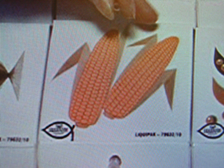
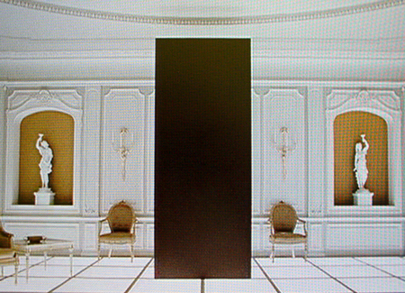
Unlike Design Observer, that discussed the film's typographic choices, mainly Futura, with an exemplary intellectual rigor, I am excited by the aesthetics and wacky spacefood packaging. The color palette is a lesson in late 1960s “sophistication”: ochre, avocado green, orange, cornflower blue, paired in black and white settings. The shapes used for doors, windows, on-screen graphics, and the monolith could all be easily converted into high-style corporate identities of the time. My favorite element, however, is the food service tray. The quirky illustrations of specific food items to be eaten through a straw are strangely out of place in the high-design aesthetic. But they give hope that there will be a home for odd and wacky when we are flying on a Pan Am shuttle to the moon.


