Fearful Symmetries
Guests visiting AdamsMorioka for the first time are often disgusted. William Pereira designed our building in 1969 as the Great Western Savings and Loan headquarters. Today it is the headquarters for Flynt Publications. The classic mid-century aesthetic has evolved into a lush “Las Vegas casino” style. I’ve grown to embrace the beautiful silk flower arrangement on each elevator lobby and the faux-marble elevator walls. The disgust our guests experience comes from our door sign. Clearly Tiffany Heavy and Optima are not expected here.
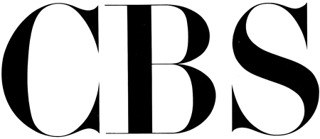
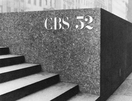
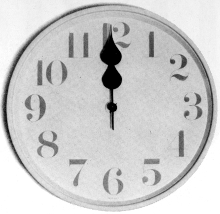
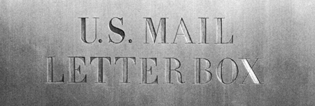
On the opposite end of the spectrum is the “black rock.” The New York headquarters for CBS designed by Eero Saarinen in 1962. The signage for the building is a flawless version of Didot. Lou Dorfsman commissioned a new version of the font specifically for CBS. This served as the corporate typeface for over a decade. As designers, we disagree on many issues: Fillmore posters sucked or ruled, modernism is over or relevant, AdamsMorioka does vapid and fun or smart and seductive. I don’t think anyone would argue, however, that the CBS Didot signage and collateral is remarkable.
Think of it this way: a client asks you to do a signage program, a designer in your office suggests Didot, what would you say? If I weren’t aware of the CBS program, I’d probably say, “Are you out of your mind? Do you really think that’s legible? Who is going to fabricate these letterforms and not break the very thin parts of the letters? Get the hell out of my office! In fact, leave for good.” Actually, I probably wouldn’t say that. I’m the nice one. Noreen would say it.
