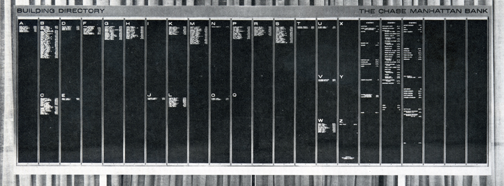
The Long, Long, Long Directory
This is a combo type nerd/sign nerd post; so if you hate type or signs, go no further. One of the challenges of working within ADA signage codes is the size. When code requires 1-inch tall letters, you tend to find condensed typefaces. Otherwise you can end up with a “Stairwell” sign that is several feet long. I was enormously jealous when I stumbled upon the Chermayeff & Geismar signage system for Chase Manhattan in 1961. The ability to use beautiful extended letterforms on signs is a luxury we no longer share. The forms are so incredibly sleek and sophisticated. The signs take advantage and exaggerate the horizontality. The incredibly long Directory is perfect in a world of black suits, white shirts, and thin ties. My favorite item, however, is the round Directory. It is like a satellite that has landed in an office lobby.
The period between 1960 and 1980, the sexual revolution, was a brief moment in the history of man when having sex did not lead to life threatening issues. So free love reigned. Do Tom and Ivan know how lucky they were to live in a time when “free-type” was the norm. This was a short period when it was safe to use light extended type when you felt the urge. I can imagine the horror on a client’s face if I presented a 15-foot directory with sleek long type. They would run screaming from the room, yelling, “Why? Why? Why so long?”


