Books and Borg
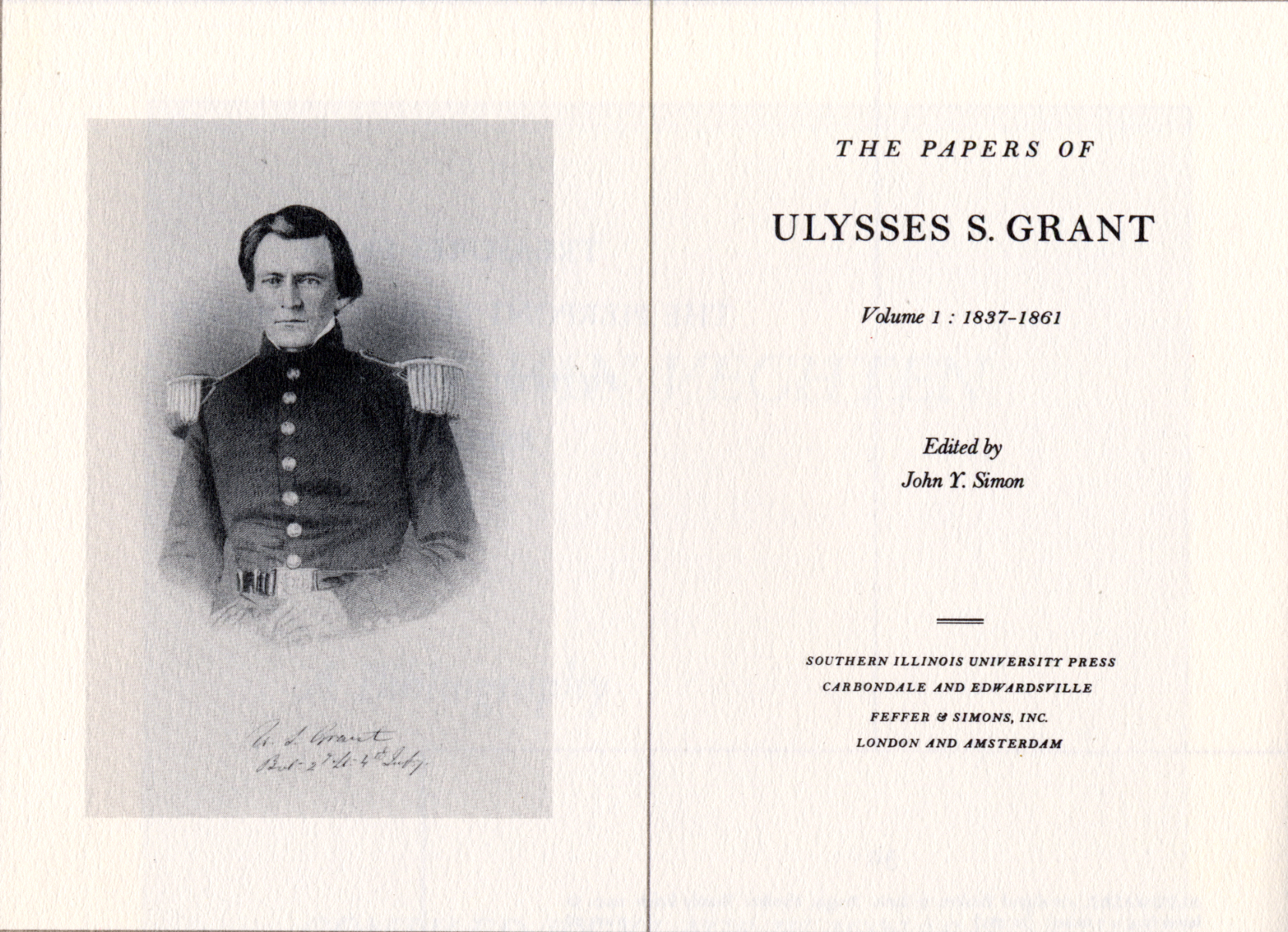
In 1986, I moved to New York and started my first job as a designer for The New York Public Library. This was a perfect fit. Book design was my first love. I was fortunate to work with two people who were masters of fine typography, Marilan Lund and William Coakley. In 1987, the Library held an exhibition on Bert (Bertram) Clarke. I knew Clarke as the designer at A. Colish in Mount Vernon, New York. There is nothing flashy in his books. The beauty is in the fine detail.
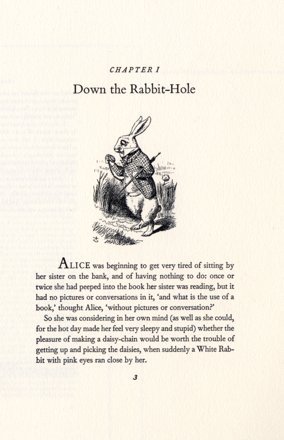
Centered typography can easily end up looking like a thermometer. I recall Marilan Lund telling me that a good symmetrical composition should be like a delicate but strong crystal chandelier. Clarke’s typeface choices are relevant to the material and always surprising. The typography on the title page for The Thistle Golf Club is not only regal, but echoes the form of a thistle. The heart dingbats for Alice’s Adventures in Wonderland are delightful and subtle. I love the treatment for the wonderful title, “A Few Rambling Remarks on Golf.” If you look closely, you can see the shape of a chandelier in all of these compositions.
There is a beautiful sense of accomplishment to groom text and focus on the most minute of typographic issues. On Star Trek Voyager, the Borg’s religion was perfection, and creating order from chaos. If only they had found Clarke’s books, they could have stopped their relentless path of galactic destruction. Hey, this might be nerdy, but you’ve got to give me props for mixing classical typography with the Borg.


