

Il dolce far niente
Lou Danziger, UCLA Extension
The hardest thing to do as a designer is nothing. Not as in, “I’ll sit on the sofa and stare at the carpet.” What I am talking about here is the restraint to let something be what it is. One of the tenets of modernism is to be true to materials. Steel should look like steel. It shouldn’t be painted to simulate wood. The idea then is to let something be what it is.
The first thing I do as a designer is reach into my bag of tricks. I can put the image inside the typography, make a bright background, overprint a big yellow word, or create a grid of interesting colors. Fortunately, I move on to actually thinking and do something different (unless a big yellow word makes sense that day). Often, the subject matter is more than enough visual interest. Or it is complex conceptually and doesn’t need flying triangles to assist in the message.
When I worked on the reface of the Sundance Channel, I built a system that had one rule: use one typeface, Bob, in all caps, the same size, on a centerline horizon. Anything behind the type was fair game. This was a network about film and ideas, not graphic tricks. It worked great for about a year, and then someone got antsy and decided to add a colored box. Then the floodgates opened and the flying boxes and graphics ran back in.
When I look at Chermayeff and Geismar’s1971 campaign for Pan Am, or Mendell and Oberer's cover for Bukowski's Notes of a dirty old man, I see how this restraint and faith in the subject works. Lou Danziger's poster for UCLA Extension is genius in it's obviousness and simplicity. And Paul Rand's stationery for Westinghouse is clear and confident. But, my favorite, is Ray Eames' handmade book, 1970.
It’s not easy to walk into a client’s office and say, “I don’t want to do anything. I just want to focus on the subject in the simplest way possible,” and then send an invoice. A great subject will always make a great solution, unless you get in the way.
Ray Eames, handmade book
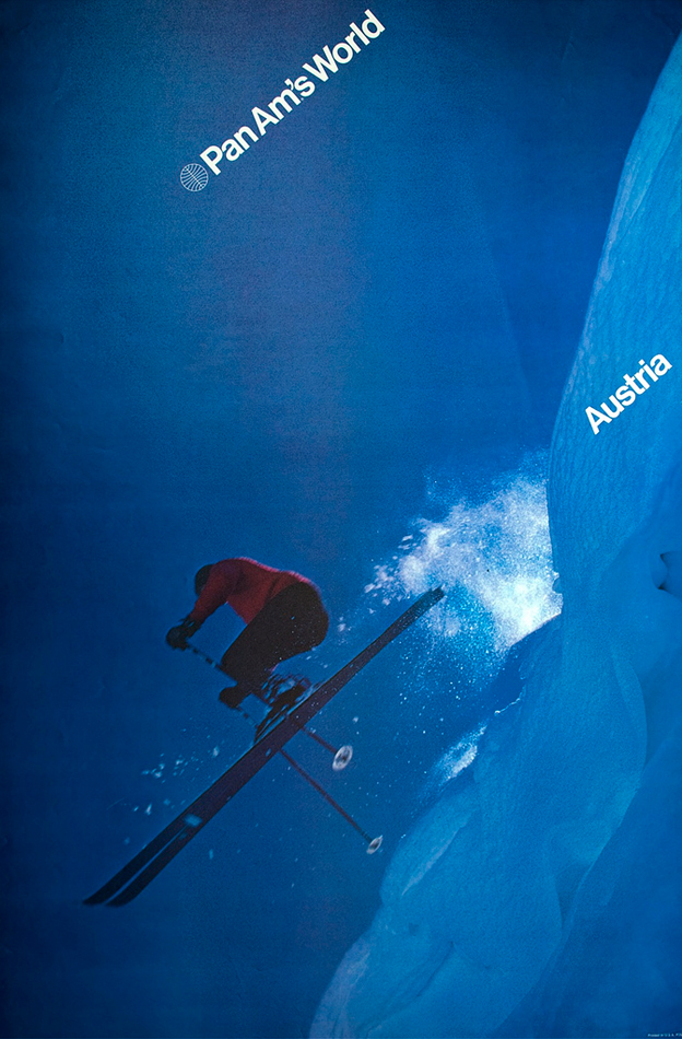
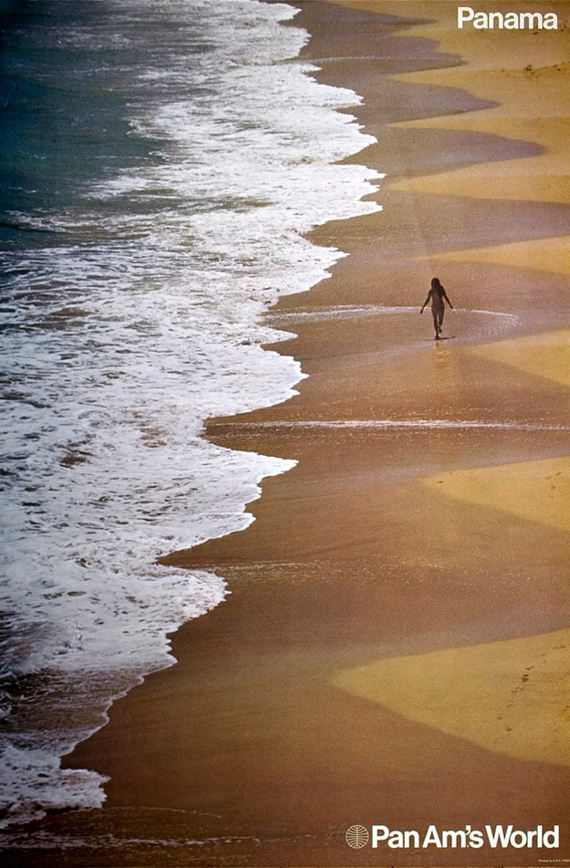

Chermayeff and Geismar, Pan Am
Mendell and Oberer


