For Whom the Bell Tolls
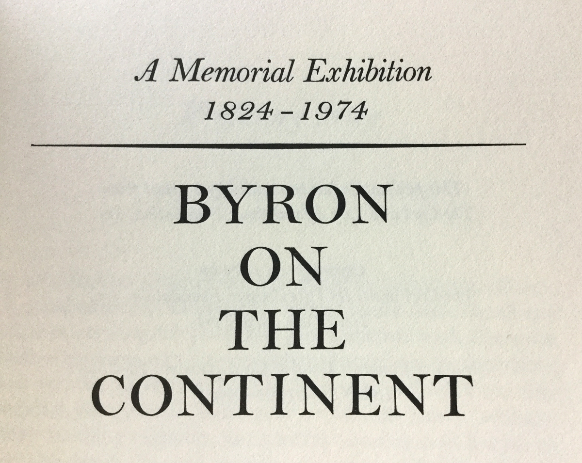
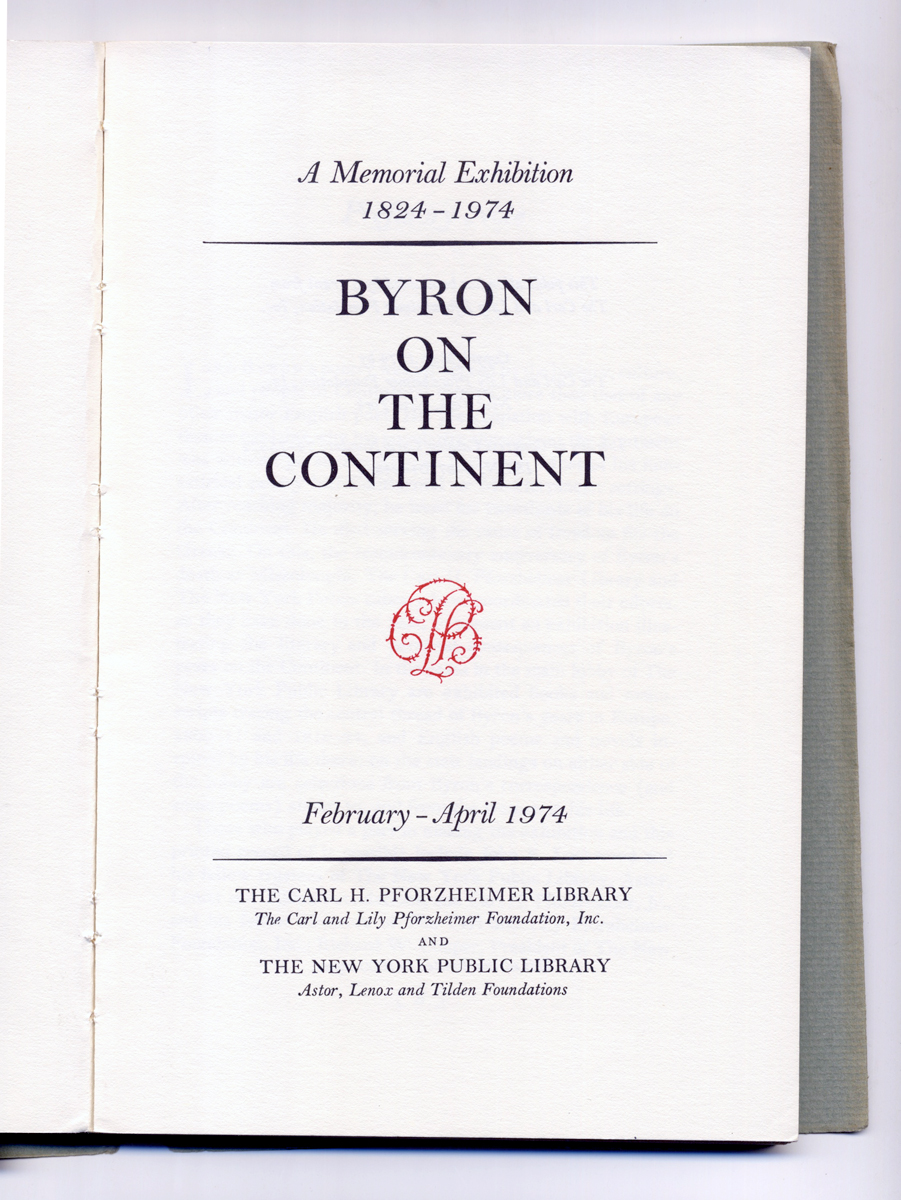
Byron the Continent, The Carl H. Pforzheimer Library
I spend too much time asking someone what typeface they used on a project. I thought I was losing my knack for identifying fonts due to dementia. I'll look closely at the page, and desperately try to find the element that will help me identify the typeface as Caslon, Baskerville, Bembo, or any of the classical serifs I know. After I give up I ask, "Ok, what is that typeface? There's something wrong with it." The answer is typically, "Oh, that's Gobbledygook (insert strange band name here)." They're odd faces found online free. That's not good. You wouldn't wear ugly clothes found online free, why would you use the sad free type?
Colophon
Monotype Bell, the way it should look
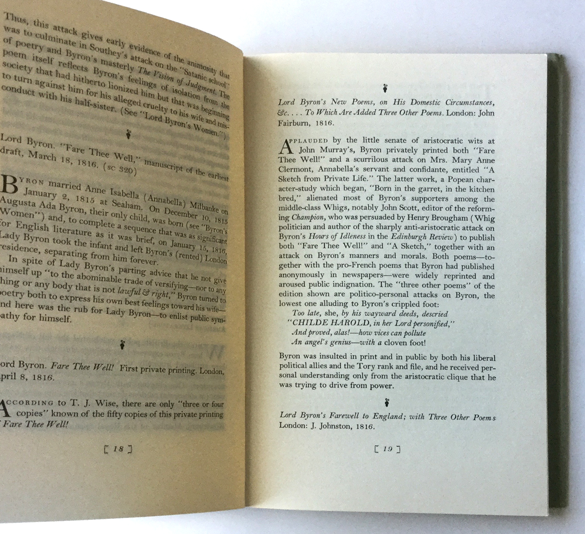
I have a book with the longest colophon ever made. If you've wondered if it's ok to list a typeface on the book credits, check this out. It's a thorough history of Bell (the serif one, not Matthew Carter's magnificent Bell Centennial). I even love the low-fi binding with stitching and a dust jacket glued to the cover.
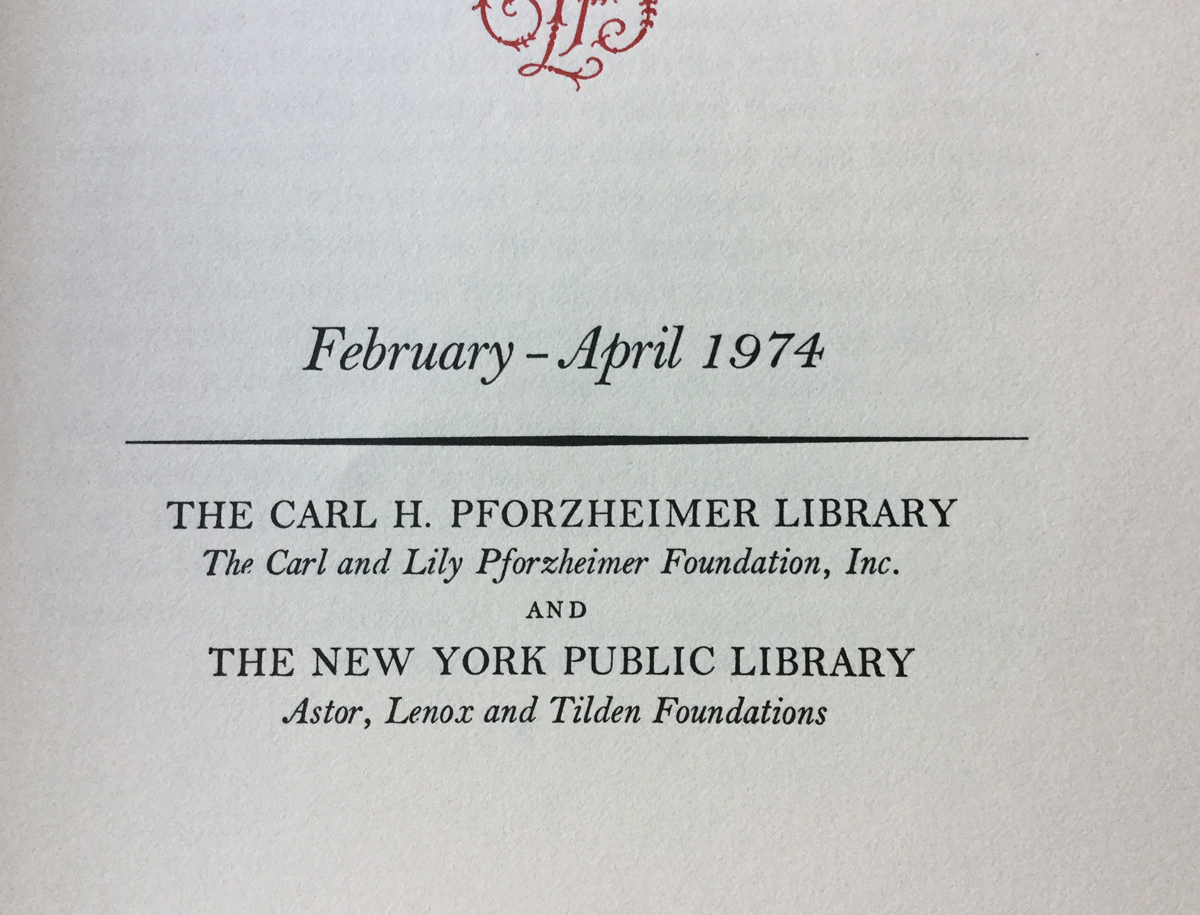
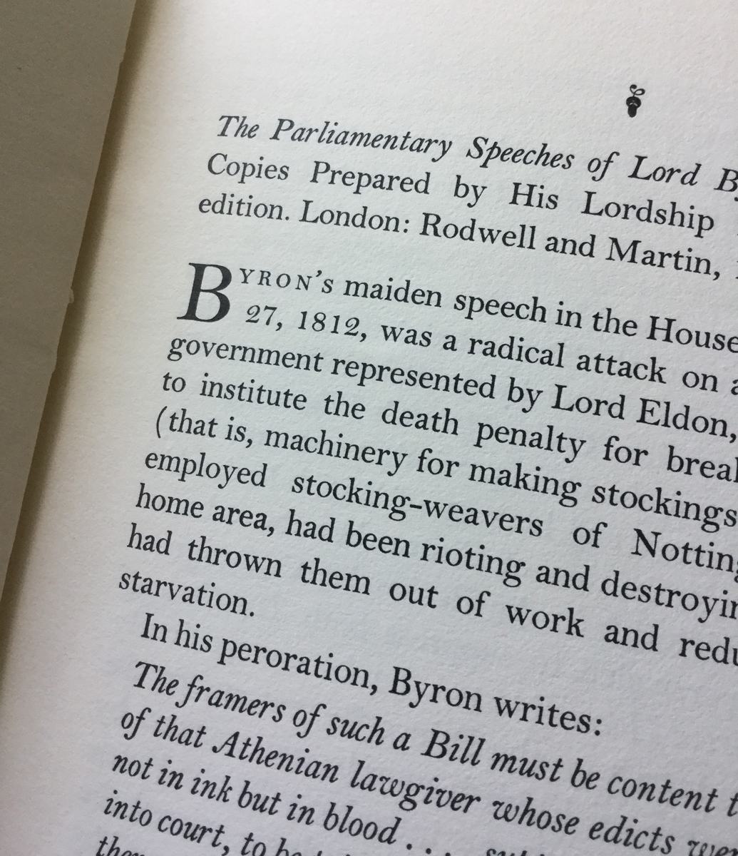
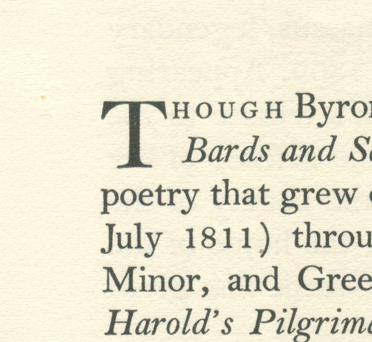
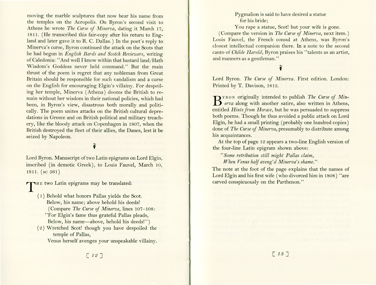
Herbert Johnson designed this edition, Byron on the Continent for the Carl H. Pfrorzheimer Foundation and The New York Public Library. It's set in metal in the most beautiful cut of Monotype Bell on Mohawk Superfine. The detail to typography is incredible. It reminds me of the rules I learned when I started out as a designer at The New York Public Library:
true small caps (not just smaller capitals)
slightly spaced small caps to aid in reading
italics 1/2 point size larger to read optically the same as roman text
aligning figures with capital letters
old style figures with upper and lower case text
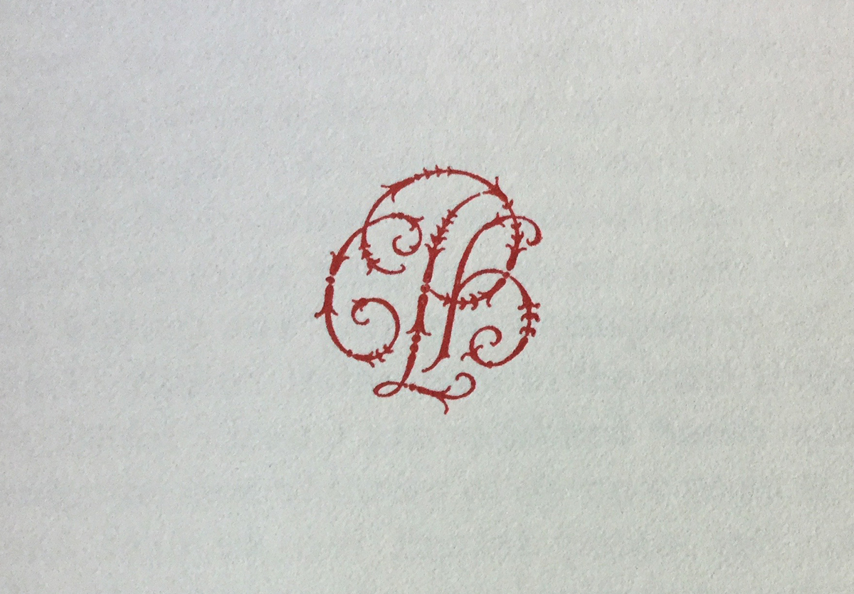
perfectly kerned initial caps
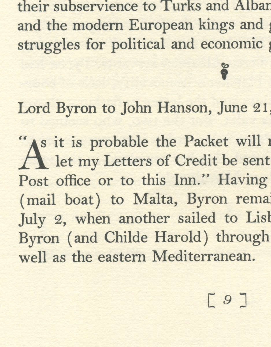
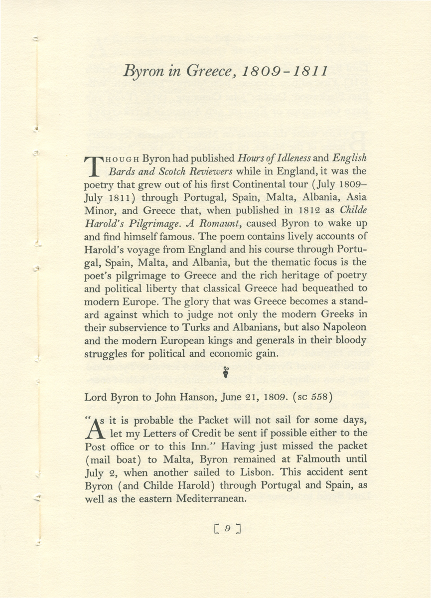
the most elegant brackets around the folios
acorns to separate content
and especially wonderful, the small cap Scilicet ( SC 561) to designate the numbers in another edition)
Don't try these without parental supervision.


Cover: Byron the Continent, The Carl H. Pforzheimer Library