

Abrams
The Designer’s Color Deck
Publisher : Abrams Books
Publication date : May 26, 2026
Language : English
Print length : 80 page
ISBN-10 : 1419784854
ISBN-13 : 978-1419784859
Item Weight : 1.11 pounds
Dimensions : 6.26 x 2.2 x 4.8 inches
The Designer’s Dictionary of Type
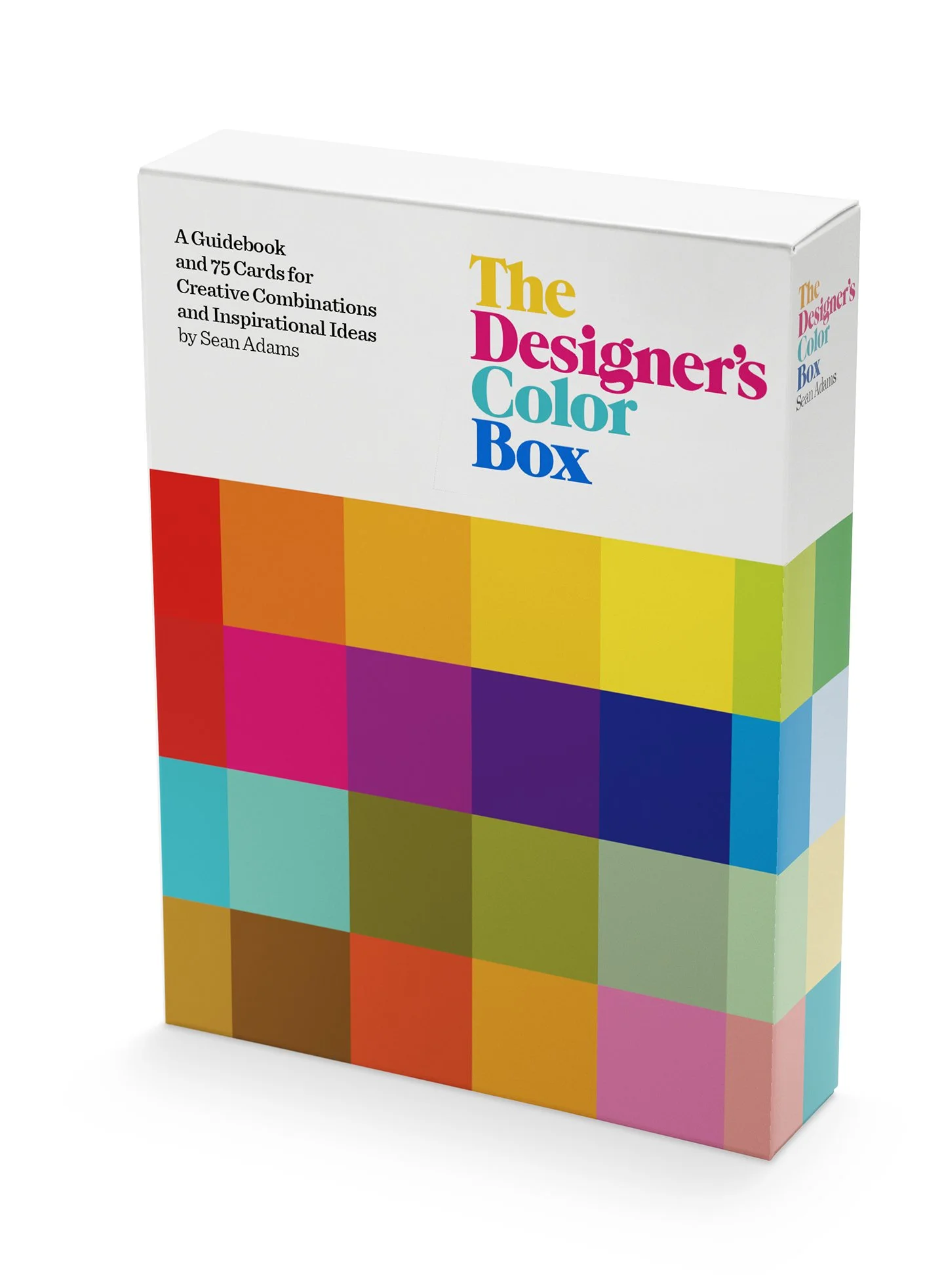
Renowned designer and author of The Designer's Dictionary of Color Sean Adams's essential tool kit for designers, featuring a portable guidebook and 75-card deck showcasing color palettes and inspiring color combinations.
The Designer’s Color Box is a must-have resource for graphic designers, interior designers, artists, and anyone who works with color. This practical and inspiring resource features a how-to guide on color combinations and a deck of cards with color palettes to spark creativity and experimentation.
The guidebook features the works of art that have inspired each palette, drawn from a range of sources including graphic design, product design, interiors, art, and fashion.
Designed to complement The Designer’s Dictionary of Color with insightful descriptions and tips, The Designer’s Color Box is the perfect interactive kit to unlocking the power of color!
The Designer’s Color Box includes:
- 75 cards featuring a color on one side to mix-and-match color palettes, with suggested combinations and CMYK and RGB values on the reverse.
- An 80-page guidebook with descriptions and works that have inspired each palette.
The Designer’s Dictionary of Type
Amazon
Hardcover: 256 pages
Publisher: Harry N. Abrams (April 2, 2019)
Language: English
ISBN-10: 141973718X
ISBN-13: 978-1419737183
Product Dimensions: 7.8 x 1 x 10 inches
Shipping Weight: 2.4 pounds


To Be Is To Be Perceived
A look into the author's process forThe Designer's Dictionary of Type by Sean Adams
by Allison Goodman
9 October, 2018
“To be is to be perceived” is the translation of 18th-century Irish philosopher George Berkeley’s motto, esse est percipi. As the most famous Western proponent of subjective idealism, Berkeley posited that objects do not exist except as phenomena perceived by humans. It is provocative to consider this idea in terms of typography. Almost nothing makes a designer coo more than an exemplary typeface used well. Alphabets are fine, but it’s in the “being” of words that letterforms achieve their ideal state. Indeed, perhaps a typeface only truly exists (certainly it only truly functions) through its perception as language.
For those who appreciate typographic excellence exemplified, Sean Adams’ The Designer's Dictionary of Type (Abrams) will materialize later this fall. It is a compendium of some of the most optimal—and surprising—examples of typography in use, dating back to 1605. The Dictionary details 45 typefaces, exploring each one through multiple studies of its best specimens. Adams’ upcoming book is a means to promote discovery—and rediscovery—of great typefaces, and inspiring ways to use them.
Because we will soon be able to see the publication itself, my conversation with Adams centered on the effort behind the book. Here are a few lists that summarize that effort, including his gathering, research, and editing strategies. Adams also shares his thoughts on what it takes for a designer to get their notable projects more widely recognized.
Organized Gathering
Sean Adams has spent decades assembling examples of all things graphic. His collections are his inspiration and his reverie. For those who follow him on social media, Adams willingly shares his treasures, peppering his feeds with mid-century delights, vintage looks at a variety of lifestyles, and typographic treats.
When queried about his collection of graphic design, Adams has no shortage of anecdotes. But even those wildly varied stories allude to Adams’ strategy of constructive collecting:
His collections connect with his personal history. Years ago, Sean found his grandfather’s US Navy manual and took a photo that now appears in the Trade Gothic section of the Dictionary.
He has collected as part of a longstanding effort of personal education.An interesting portent to Adams landing at ArtCenter College of Design (he is currently the Acting Chair of the Graduate and Undergraduate Graphic programs), Adams began collecting the work of his future colleague and HMCT Creative Director Simon Johnston — a founding member of the studio that published 8vo from1986 to 1992 — years before the two were even acquainted.
Adams keeps his collection in excellent order. In addition to being a spirited collector, Adams is also admirably organized regarding his digital and physical collections. When the time came for him to draw on this deep resource for The Designer’s Dictionary of Type, he was very, very ready.
Researching in All the Right Places
In order to include a range of quality examples in The Designer’s Dictionary of Type beyond his existing collection, Adams proceeded on a research journey that he describes as “Hard, actually.” Here’s where a discerning eye and a nose for ‘the hunt’ acted in his favor. Sometimes Adams found exactly what he was looking for. An equally important strategy was that he was also tuned in to recognizing and gathering the unexpected, as with the Skirted Men 7 pamphlet (designer unknown), featuring some exquisite Trade Gothic:
When asked if he would share his go-to resources for both directed research and serendipitous opportunities, Adams quickly rattled off the following:
The Library of Congress. Located in Washington DC, the LOC is the largest library in the world (housing over 167 million items on over 800 miles of bookshelves). Even better, much of its collection is in the public domain, as with Lester Beall’s 1930 poster series for the Rural Electrification Administration of the U.S. Department of Agriculture.
The Metropolitan Museum of Art (The Met) website features Open Access Artworks, a resource with “more than 375,000 hi-res images of public-domain works from the collection, all of which can be downloaded, shared, and remixed without restriction.”
The AIGA Archives.
Our local resources at the HMCT Archives and the ArtCenter Library Rare Books collection.
And of course, your network of designers and their work.
A Curator’s Eye
With so many typefaces to choose from, Adams allowed history, personal preference, and his role as an educator guide his curatorial theme: the importance of developing one’s eye through discernment. And therein lies a prime motivation behind this book: getting people to appreciate good design, in this case good typography, by example. (Adams’ decision to include 45 curated faces with multiple examples differs significantly in approach from the recently published survey A Visual History of Type (Laurence King) by Paul McNeil, which includes 320 typefaces, each illustrated by the singular example of its original type specimen. Both are good additions to any type library.)
Considering Adams’ imperative of multiple examples of each typeface, certain decisions were made for him by twists of fate; specifically that certain typefaces come into, and then go out of, style (or get tossed into the River Thames as happened with Doves in 1917). Some of Adams’ unexpected curatorial discoveries included
There simply weren’t enough examples of Goudy past 1930 to include in the book . . . it would seem that this classic fell out of favor. Adams is hoping for a ‘next time’ for Goudy, not only for the beauty of the face, but also to illuminate the story behind Frederic W. Goudy himself: a bookkeeper who taught himself printing and typography before changing careers mid-life.
Designed in 1929 by Rudolf Wolfe, Memphis’ use fell away by the 1940s. This could be due to a concerted effort by Monotype to promote their new typeface Rockwell, similar to both Memphis and Stymie, beginning in 1934. In any case, Memphis suffered the same fate as Goudy and could not be included in the book.
Univers made it into the Dictionary, but Sean found surprisingly few inspiring examples post 1990 to include. Perhaps that decline in use can be attributed to the rise of deconstructed typography and a trend away from what some might call the structural absolutism of Adrian Frutiger’s seminal typeface.
Be Ready When a Publisher Comes Calling
It’s one thing to find the perfect image to make a visual point; it’s another to have the right to publish that image. And it’s a third to stay organized enough to know if you have received that permission before you go to press. Anyone who has authored a book predicated on examples of artwork from others will tell you that obtaining those permissions is an unforgiving task.
But Adams’ bigger point about rights comes into play when the tables are turned. He stressed that being prepared to grant permission to a requesting author is a huge part of becoming more widely recognized in the field. For designers hoping to build their reputation, it’s crucial to be ready with images, permissions, descriptions, and bios to send off without delay—as many of the design studios included in The Dictionary can testify.
A Typographic Appreciation
Even after getting lost in musty archives (both digital and actual flat file drawers), nurturing rights and permissions to fruition, and having to say adieu to a few favorite typefaces, Sean Adams is still genuinely excited for the publication of this new book. He’s an idealist in that way, striving for the production of knowledge so that our collective visual experience gets just a bit closer to the ideals—and ideas—of typographic excellence.
The Designer's Dictionary of Color


A Garden Can Be Anywhere


