
Domestika

UCLA
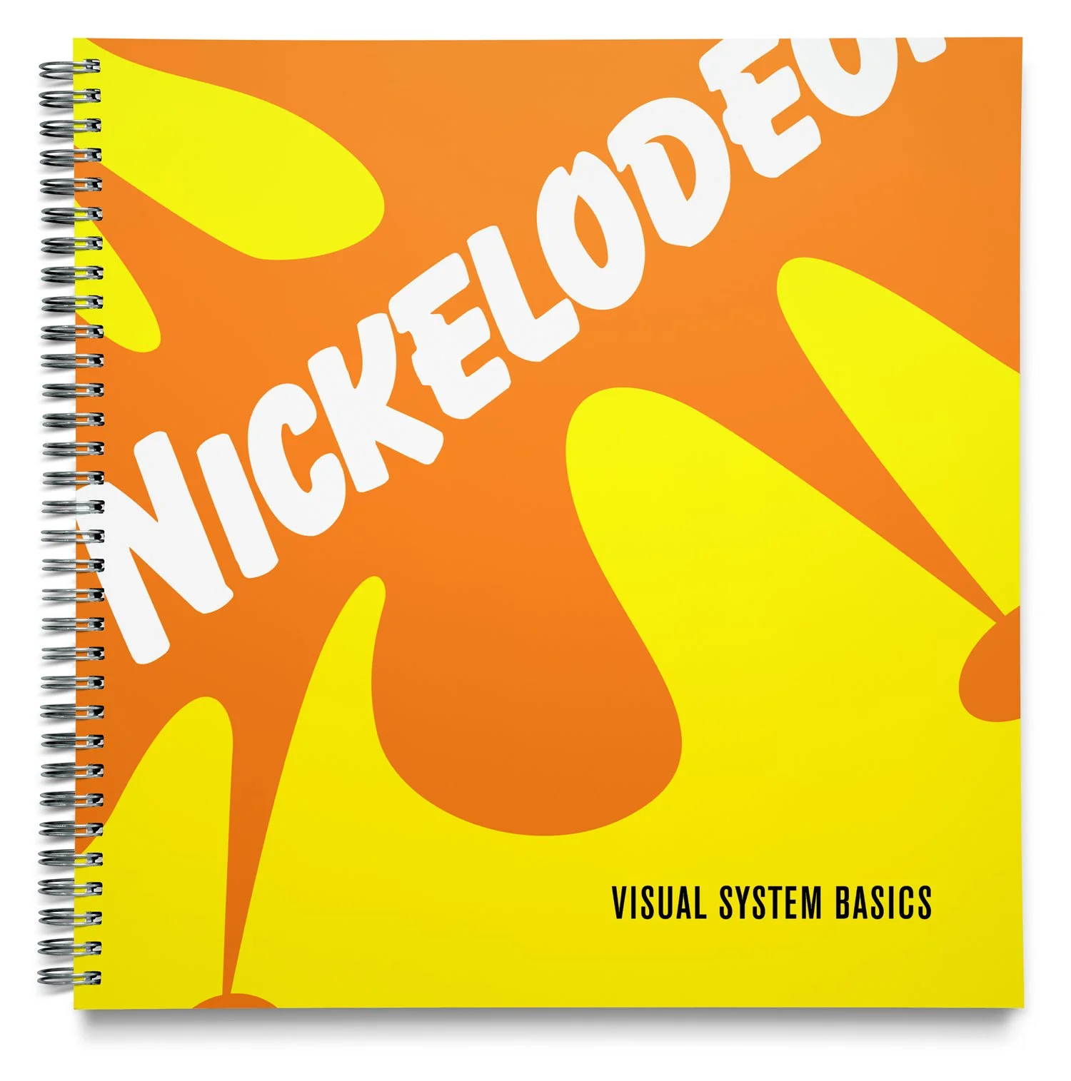
Nickelodeon

Sundance

How Design Makes Us Think

ArtCenter MDes launch

Shields Foundation

Mexico Restaurante

Mohawk Fine Paper

Tolerance
Adobe Learning

Disney XD

The Designer's Dictionary of Type

The Designer's Dictionary of Color
Gap signage

Library Foundation of Los Angeles

ArtCenter Notebooks 2023

Queert the vote

La Nouvelle Vague Festival
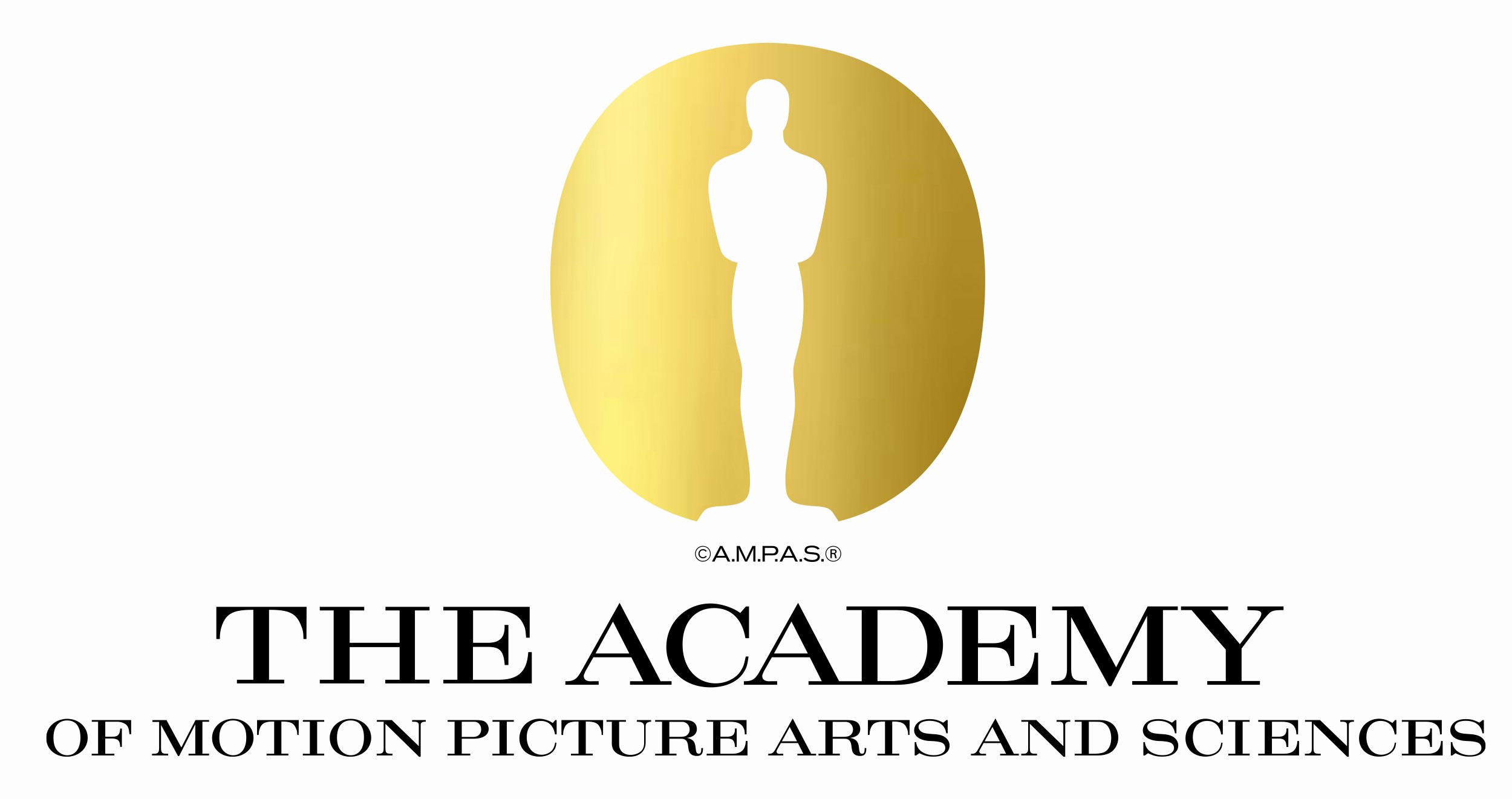
AMPAS

How Design Makes Usw Think

Make to Know

The New York Public Library

America The Atlas

Shields Foundation

Filmforum Los Angeles

Sundance Channel

The York

https://www.domestika.org/en/courses/5147/sean_adams_1